
CSSnote3: CSS building blocks
CSS building blocks
Cascade and inheritance
Conflicting rules
The cascade
Stylesheets cascade. The order of CSS rules matter. When two rules have equal specificity, the last one will be used.
e.g.
1
2
3
4
5
6
h1 {
    color: red;
}
h1 {
    color: blue;
}
-> <h1> will be colored blue
Specificity
If multiple rules have different selectors but still select the same element, the browser decides which rule to apply by the specificity. It is basically a measure of how specific a selector’s selection will be:
- An element selector is less specific
- A class selector is more specific
e.g.
1
2
3
4
5
6
7
.main-heading {
    color: red;
}

h1 {
    color: blue;
}
-> <h1> with class .main-heading will be colored red.
Inheritance
Some CSS property values in the parent elements are inherited by their child elements, and some aren’t. For example, color and font-family inherit, but width does not inherit.
Understanding how the concepts work together
These three concepts(cascade, specificity, and inheritance) together control which CSS applies to what element
Understanding inheritance
Example
CSS:
1
2
3
4
5
6
7
8
9
10
.main {
    color: rebeccapurple;
    border: 2px solid #ccc;
    padding: 1em;
}

.special {
    color: black;
    font-weight: bold;
}
HTML:
1
2
3
4
5
6
7
8
9
10
11
12
13
14
15
16
17
18
19
20
<ul class="main">
    <li>Item One</li>
    <li>Item Two
        <ul>
            <li>2.1</li>
            <li>2.2</li>
        </ul>
    </li>
    <li>Item Three
        <ul class="special">
            <li>3.1
                <ul>
                    <li>3.1.1</li>
                    <li>3.1.2</li>
                </ul>
            </li>
            <li>3.2</li>
        </ul>
    </li>
</ul>
| Result: |
|---|
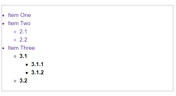 |
- We have given the outer
<ul>(with classmain) a border, padding, and font color. The color has applied to the direct children, but also the indirect children. Same for another classspecial. But things like widths, margins, padding, and borders do not inherit.(Probably not an effect we would ever want!) - Which properties are inherited by default and which aren’t is largely **down to common sense.
Controlling inheritance
There are four special universal property values for controlling inheritance. Every CSS property accepts these values.
inherit- sets the property value to be the same as that of its parent element
- “turns on inheritance”
initial- sets the property value to the initial value of that property
unset- resets the property to its natural value(If the property is naturally inherited it acs like
inherit, otherwise it acts likeinitial) - property가
color같은거면inherit,width같은거면initial과 같이 취급, shorthand로 다 같이 정의할 때 omitting으로 문제 일어나지 않도록 쓰는 용도인듯
- resets the property to its natural value(If the property is naturally inherited it acs like
revert: newer value, limited browser support
Example
CSS:
1
2
3
4
5
6
7
8
9
10
11
12
13
14
15
body {
    color: green;
}

.my-class-1 a {
    color: inherit;
}

.my-class-2 a {
    color: initial;
}

.my-class-3 a {
    color: unset;
}
HTML:
1
2
3
4
5
6
<ul>
    <li>Default <a href="#">link</a> color</li>
    <li class="my-class-1">Inherit the <a href="#">link</a> color</li>
    <li class="my-class-2">Reset the <a href="#">link</a> color</li>
    <li class="my-class-3">Unset the <a href="#">link</a> color</li>
</ul>
| Result: |
|---|
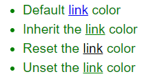 |
a { color: red;}를 추가하면 맨 위 링크만 빨간색으로 변함(다른 것들은' 'combinator, class selector로 specificity가 더 높은 rule이 적용되어있기 때문)
Resetting all property values
The CSS shorthand property all represents all properties. So we can use it usefully when we debug. If we apply all: unset; declaration, all rules applied will be initialized except the inherited properties.
Example
CSS:
1
2
3
4
5
6
7
8
blockquote {
    background-color: red;
    border: 2px solid green;
}

.fix-this {
    all: unset;
}
HTML:
1
2
3
4
5
6
7
<blockquote>
	<p>This blockquote is styled</p>
</blockquote>

<blockquote class="fix-this">
	<p>This blockquote is not styled</p>
</blockquote>
| Result: |
|---|
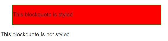 |
all도 다른 property와 같이 conflicting rule에 의해 처리됨all은 모든 property를 포함하기 때문에 padding과 같은 ruleset으로 정의하지 않았지만 기본적으로 정의해주는 속성(padding, margin 등)도 같이unset됨
Understanding the cascade
There are three factors to consider. Later ones overrule earlier ones:
- Source order
- Specificity
- Importance
Source order
- Exactly the same weight -> the last one wins.
Specificity
- More specific rule is chosen by the browser.(Specificity > Source order)
- A class selector has more weight than an elemen selector -> class selector rules will override the element selector rules.
- overwrite only the same properties, not the entire rules!
- To avoid repetition, define generic styles for the basic elements then create classes for specific cases.
How to calculate specificity
Essentially a value in points is awarded to different types of selectors, and adding these up gives you the weight of that particular selector, which can then be assessed against other potential matches.
The amount of specificity is measured using four different values(thousands, hundreds, tens, and ones):
- Thousands : 1 if declaration is inside a
styleattribute(= inline styles) -> No selectors, so always specificity=1000 - Hundreds : 1 for each ID selector contained inside the overall selector
- Tens : 1 for each class selector, attribute selector, or pseudo-class contained inside the overall selector
- Ones : 1 for each element selector or pseudo-element contained inside the overall selector
Note: The universal selector(*), combinators(+, >, ~, ' '), and negation pseudo-class(:not) have no effect on specificity
Example
1
2
3
4
5
6
7
8
9
10
11
12
13
14
15
16
17
18
19
20
21
22
23
24
25
26
27
28
29
30
31
32
33
34
/* specificity: 0101 */
#outer a {
    background-color: red;
}

/* specificity: 0201 */
#outer #inner a {
    background-color: blue;
}

/* specificity: 0104 */
#outer div ul li a {
    color: yellow;
}

/* specificity: 0113 */
#outer div ul .nav a {
    color: white;
}

/* specificity: 0024 */
div div li:nth-child(2) a:hover {
    border: 10px solid black;
}

/* specificity: 0023 */
div li:nth-child(2) a:hover {
    border: 10px dashed black;
}

/* specificity: 0033 */
div div .nav:nth-child(2) a:hover {
    border: 10px double black;
}
- A 11 class selectors combined would not overwrite the rules of one id selector! This is only an approximate example for ease of understanding.
- 하지만 113, 112 순으로 rule이 선언되어 있으면 112는 적용이 안됨.(자릿수가 이해를 돕기 위한 개념이라는 것이지 각 selector의 정량적 차이는 specificity 계산에 적용이 됨!!!)
!important
!important makes a declaration the most specific thing.
Example
CSS:
1
2
3
4
5
6
7
8
9
10
11
12
13
14
15
16

#winning {
    background-color: red;
    border: 1px solid black;
}

.better {
    background-color: gray;
    border: none !important;
}

p {
    background-color: blue;
    color: white;
    padding: 5px;
}
HTML:
1
2
<p class="better">This is a paragraph.</p>
<p class="better" id="winning">One selector to rule them all!</p>
| Result: |
|---|
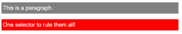 |
- id selector가 두 번째 p에 적용되어 원래는 테두리가 있어야 하지만 class selector의 속성을 따름
- class selector의 border declaration에
!important가 있기 때문에 specificity가 가장 높게 설정되었기 때문에 overriding되지 않음
- class selector의 border declaration에
!important처리 되어있는 declaration을 overriding하는 방법- 같은 specificity를 가진, 뒤에 있는 selector의 같은 att declaration에
!important를 적용(source order를 이용) - 더 높은 specificity를 가진 selector의 같은 att declaration에
!important적용
- 같은 specificity를 가진, 뒤에 있는 selector의 같은 att declaration에
※ Don’t use it if you can avoid it
The effect of CSS location
The importance of a CSS declaration depends on what stylesheet it is specified in. It is possible for users to set custom stylesheets to override the developer’s styles.
To summarize
Conflicting declarations will be applied in the following order, with later ones overriding earlier ones:
- Declarations in user agent style sheets (e.g. the browser’s default styles, used when no other styling is set)
- Normal declarations in user style sheets (custom styles set by a user)
- Normal declarations in author style sheets (these are the styles set by us, the web developers)
- Important declarations in author style sheets
- Important declarations in user style sheets
Sometimes users have to override web developer styles. This can be achieved by using !important in their rules.
CSS selectors
What is a selector?
- The first part of a CSS Rule
- A pattern of elements and other terms tell the browser which HTML elements should be selected
- The selected element(s) are referred to as the subject of the selector
- Selectors are defined in the CSS Selectors specification(The majority of selectors are defined in the Level 3 Selectors specification, which is a mature specification)
Selector lists
The individual selectors can be combined into a selector list so that the rule is applied to all of the individual selectors. (By adding a comma)
- White space is valid before or after the comma
- If any selector in the group is invalid, the whole rule will be ignored!
e.g.
1
2
3
4
h1,
.special {
  color: blue;
}
※ Types of selectors
There are a few different groupings of selectors.(about 4 groups)
Type, class, and ID selectors
This group includes selectors that target an HTML element, a class(.) or an ID(#).
1
2
3
h1 {}
.box {}
#unique {}
Type selectors
- also known as tag name selector or element selector
e.g.span { color: rebeccapurple; }
The universal selector *
The universal selector(*) selects everything in the document(or inside the parent element). Since the universal selector makes global changes, we use it for very specific situations, such as making selectors easier to read(article :first-child to article *:first-child)
Class selectors .
2 ways to use class selector
- Target classes on particular elements :
span.highlight - Target an element has more than one class applied :
.notebox.warning
ID selector #
- Target an ID on particular elements :
h1#heading - Don’t use the same ID multiple times in a document!(causes strange behavior)
- Use in situations like you don’t have access to the markup and cannot edit it
Attribute selectors
The attriute selectors select certain attribute(or with a particular value) on an element:
1
2
a[title] {}
a[href="https://example.com"] {}
Presence and value selectors
| Selector | Example | Description |
|---|---|---|
| [attr] | a[title] |
elements with an attr attribute |
| [attr=value] | a[href="https://example.com"] |
elements with an attr attribute whose value is exactly value |
| [attr~=value] | p[class~="special"] |
elements with an attr attribute whose value is exactly value, or contains value in its (space separated)list of values |
| [attr|=value] | div[lang | ="zh"] |
elements with an attr attribute whose value is exactly value or begins with value immediately followed by a hyphen(-) |
div[lang|="zh"]는<div lang="zh-*">를 선택함- [attr=value]는 값이 정확히 value인것만(다른 값이 더 있을 경우 선택하지 않음)
[attr~=value]는 값에 value가 포함된 것(whitespace-separated list에)
즉, [class=”a”]는 class=”a b”인 element를 포함하지 않음!! - [class~=”a”]가 class=”ab”인 element를 포함하지 않음!!(list에 원소가 ab이기 때문)
Substring matching selectors
| Selector | Example | Description |
|---|---|---|
| [attr^=value] | li[class^="box-"] |
elements with an attr attribute whose value begins with value |
| [attr$=value] | li[class$="-box"] |
elements with an attr attribute whose value ends with value |
| [attr*=value] | li[class*="box"] |
elements with an attr attribute whose value contains value anywhere within the string |
Case-sensitivity
- Add
ibefore the closing bracket(]) to match attribute values case-insensitively!
e.g.li[class^="a" i]matches<li class="Ab"> sfor forcing case-sensitive, but not very useful, less supported
Pseudo-classes and pseudo-elements
This group of selectors includes pseudo-classes, pseudo-elements.
Pseudo-classes
Pseudo-classes is a selector that style certain states of an element.
Pseudo-classes are keywords that start with a colon.
Simple pseudo-classes
They tend to act as if you had applied a class to some part of your document, often helping you cut down on excess classes in your markup, and giving you more flexible, maintainable code.
:first-child,:last-child,:only-child,:invalid(<input>,<form>에서 입력이 invalid할 때), …article p:first-childselects<p>which is first child of<article>:first-childis equivalent to*:first-child
User-action pseudo classes(dynamic pseudo-classes)
They tend to act as if a class had been added to the element when the user interacts with it.
:hover,:focus,:link, …
Pseudo-elements
Pseudo-elements(::) select a certain part of an element rather than the element itself.
Pseudo-elements behave in a similar way, however they act as if you had added a whole new HTML element into the markup, rather than applying a class to existing elements.
Pseudo-elements start with a double colon ::.
Some early pseudo-elements used the single colon syntax, modern browsers support single- or double-colon syntax for backwards compatibility.
::first-linearticle p::first-lineselects the first line of<p>which is nested in<article>
Combining pseudo-classes and pseudo-elements
article p:first-child::first-line
Generating content with ::before and ::after
These(::before, ::after) are used along with the content property to insert content into your document using CSS. This use is referred to as “Generated Content” in CSS.
Example
1
2
3
.box::before {
  content: "This should show before the other content.";
}
.box클래스가 적용된 element 전에content의 property value가 표시됨- "”을
content의 value로 넣고display: block;을 적용해서 도형같은걸 넣을 수도 있음 - 텍스트를 value로 넣어도 브라우저에서 그 텍스트 선택 불가(
가끔 리스트 마커가 드래그되지 않을 때가 있었는데 이렇게 추가한듯리스트 마커는li의list-style-type으로 조정!)
Combinators
The combinators combine other selectors in order to target elements within our documents.
Descendant combinator
The descendant combinator(' ') combines two selectors(A B) such that B is selected if B has A as its ancestor.
Selectors that utilize a descendant combinator are called descendant selectors.
Example
body article p selects <p> inside <article> which is inside <body>.
Child combinator
The child combinator(>) combines two selectors(A > B) such that B is selected if B is a direct children of A.
Descendant elements further down don’t match.
The following selects paragraphs that are direct children of <article> elements using the child combinator(>):
1
2
3

article > p {}
※ Descendant combinator ' ' selects all the descendants while child combinator(>) selects direct children.
Adjacent sibling combinator
The adjacent sibling selector(+) is placed between two CSS selectors(A + B). It matches only those elements matched by the B that are the next sibling element of the A.
A common use case is to do something with a paragraph that follows a heading, such as abstract.
Example
h1 + p selects paragraphs after <h1>
General sibling combinator
The general sibling combinator(~) combines two selectors(A ~ B). It selects all the B that are siblings of A, even not directly adjacent.
Example
p ~ img selects all <img> elements that come anywhere after <p> elements.
Using combinators
Take care however when creating big lists of selectors that select very specific parts of your document. It will be hard to reuse the CSS rules as you have made the selector very specific to the location of that element in the markup.
It is often better to create a simple class and apply that to the element in question. That said, your knowledge of combinators will come in very useful if you need to get to something in your document and are unable to access the HTML, perhaps due to it being generated by a CMS.
The box model
Block and inline boxes
In CSS, there are broadly two types of boxes - block boxes and inline boxes. These characteristics refer to how the box behaves in terms of page flow, and in relation to other boxes on the page:
Block box
- The box will break onto a new line.
- The box will extend in the inline direction to fill the space available in its container.
- The
widthandheightproperties are respected. - Padding, margin and border will cause other elements to be pushed away from the box.
By default, headings and <p> use block as their outer display type.
Inline box
- The box will not break onto a new line.
- The
widthandheightproperties will not apply. - Vertical padding, margins, and borders will apply but will not cause other inline boxes to move away from the box.
- Horizontal padding, margins, and borders will apply and will cause other inline boxes to move away from the box.
By default, <a>, <span>, <em>, <strong> display inline.
The type of box(block, inline) is defined by display property and these are the outer value of display.
Aside: Inner and outer display types
Boxes have an inner display type which dictates how elements inside that box are laid out.(cf. outer display type : block / inline)
By default, the elements inside a box are laid out in normal flow(just like any other block and inline elements)
With display: flex;, the outer display type is block, but the inner display type is changed to flex.(There are various other inner values such as grid)
Examples of different display types
CSS:
1
2
3
4
5
6
7
8
9
10
11
12
13
14
15
16
17
18
19
20
p,
ul {
  border: 2px solid rebeccapurple;
  padding: .5em;
}

.block,
li {
  border: 2px solid blue;
  padding: .5em;
}

ul {
  display: flex;
  list-style: none;
}

.block {
  display: block;
}
HTML:
1
2
3
4
5
6
7
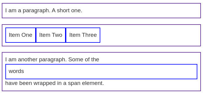
<p>I am a paragraph. A short one.</p>
<ul>
<li>Item One</li>
<li>Item Two</li>
<li>Item Three</li>
</ul>
<p>I am another paragraph. Some of the <span class="block">words</span> have been wrapped in a <span>span element</span>.</p>
| Result: |
|---|
 |
CSS:
1
2
3
4
5
6
7
8
9
10
11
12
13
14
15
16
17
18
19
p,
ul {
  border: 2px solid rebeccapurple;
}

span,
li {
  border: 2px solid blue;
}

ul {
  display: inline-flex;
  list-style: none;
  padding: 0;
}

.inline {
  display: inline;
}
HTML:
1
2
3
4
5
6
7
8
9
10
11
12
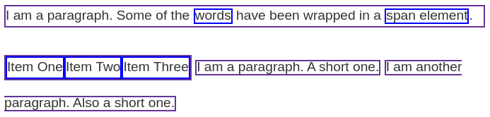
<p>
I am a paragraph. Some of the
<span>words</span> have been wrapped in a
<span>span element</span>.
</p>
<ul>
<li>Item One</li>
<li>Item Two</li>
<li>Item Three</li>
</ul>
<p class="inline">I am a paragraph. A short one.</p>
<p class="inline">I am another paragraph. Also a short one.</p>
| Result: |
|---|
 |
block: 새로운 줄에서 시작, 너비 지정 없으면 부모 노드의 너비를 모두 차지,span과 같은 inline element에도display: block;을 부여할 수 있음, 반대도 가능(ul에 inline 부여)inline: 줄바꿈 없음, ‘글자처럼 취급’이랑 비슷flex: 적용 대상 element에 자식노드가 있어야 함(flex를 부여하면 자식노드들이 flex하게 display됨), 부모노드는 block인데 부모노드가 차지한 영역을 flex하게 자식노드들이 나눠가짐inline-flex: 부모노드가 inline element로 display되고 자식노드들을 표시하는데 필요한 공간만큼만 차지함, 줄바꿈 없음
What is the CSS box model?
The full CSS box model applies to block boxes(inline boxes use only some of the behavior defined in the box model).
Parts of a box
Layers in the block box:
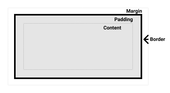
- Content box : content area
- size :
width,height
- size :
- Padding box : padding around the content as white space
- size :
paddingand related properties
- size :
- Border box : border box wraps the content and any padding
- size and style :
borderand related properties
- size and style :
- Margin box : outermost layer, wrapping the content, padding and border as whitespace between this box and other elements
- size :
marginand related properties
- size :
The standard CSS box model
In the standard box model, width and height defines the width and height of the content box. Then any padding and border is added.
Example
CSS:
1
2
3
4
5
6
7
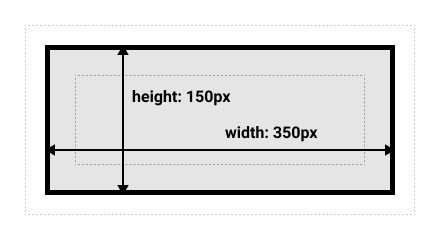
.box {
width: 350px;
height: 150px;
margin: 10px;
padding: 25px;
border: 5px solid black;
}
| Result: |
|---|
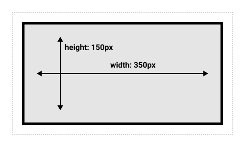 |
The space taken up by the box using the standard box model will be 410px(350+25+25+5+5) * 210px(150+25+25+5+5).
Note: The margin is not counted towards the actual size of the box. It affects only the space outside the box. The box’s area stops at the border.(보여지는 박스의 크기는 border까지임)
The alternative CSS box model
In the alternative box model, width is the width of the visible box(width to the border). Therefore the content area width is width minus the width for the padding and border.
Example
The same CSS as used above would give the below result.
By default, browsers use the standard box model.
Use box-sizing: border-box; to turn on the alternative model.
To set all the elements to use the alternative box model:
1
2
3
4
5
6
html {
  box-sizing: border-box;
}
*, *::before, *::after {
  box-sizing: inherit;
}
Internet Explorer used to default to the alternative box model, with no mechanism available to switch.
Margins, padding, and borders
Margin
- invisible space around an box.
- can have positive or negative values
- longhand properties :
margin-top,margin-right,margin-bottom,margin-left
Margin collapsing
If there are two elements whose margins touch,
- both margins are positive : those margins will combine to become one margin, bigger of the two
- one or both margins are negative : the amount of negative value will subtract from the total(하나만 음수면 더한 값을 사용, 둘 다 음수면 둘 중 더 작은 값을 사용)
Borders
There are four borders(top, right, bottom, left), and each border has a style, width and color that we might want to manipulate.
Example
1
2
3
4
5
border: 1px groove grey;
border-top: 1px double grey;
border-style: dashed ridge none dotted;
border-right-width: 2px;
border-bottom-color: blue;
- 방향이 포함된 properties에서는 모양(1px double grey 같이)을 shorthand로 사용할 수 있고, 모양이 포함된 properties에서는 방향을 shorthand로 사용할 수 있음
- 뱡향과 모양을 한꺼번에 shorthand로 사용할 수는 없음(
border: 1px solid black 2px double pink이런거 안됨)
Padding
- space between the border and the content area
- no negative values
- longhand properties :
padding-top,padding-right,padding-bottom,padding-left
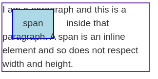
The box model and inline boxes
As we mentioned above at the Inline boxes,
widthandheightare ignored- vertical margin and padding are respected but don’t change the relationship of other content to our inline box
- horizontal margin and padding are respected and cause other content to move away from the box
Example
CSS:
1
2
3
4
5
6
7
8
span {
  margin: 20px;
  padding: 20px;
  width: 80px;
  height: 50px;
  background-color: lightblue;
  border: 2px solid blue;
}
HTML:
1
2
3
<p>
    I am a paragraph and this is a <span>span</span> inside that paragraph. A span is an inline element and so does not respect width and height.
</p>
| Result: |
|---|
 |
Using display: inline-block
inline-block is a middle ground between inline and block.
- The
widthandheightproperties are respected padding,margin, andborderwill cause other elements to be pushed away from the box
=> avoid the overlapping like above, but inline
Example
CSS:
1
2
3
4
5
6
7
8
9
span {
  margin: 20px;
  padding: 20px;
  width: 80px;
  height: 50px;
  background-color: lightblue;
  border: 2px solid blue;
  display: inline-block;
}
HTML:
1
2
3
<p>
    I am a paragraph and this is a <span>span</span> inside that paragraph. A span is an inline element and so does not respect width and height.
</p>
| Result: |
|---|
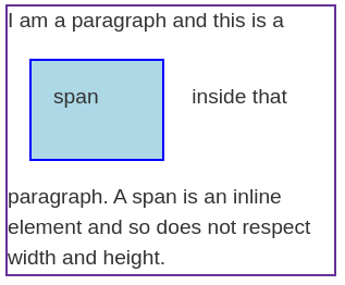 |
- 저 예제에서는 80!=20+20+2+2이므로 standard box model 사용중
<p>는 block element이기 때문에<span>에display: block;을 적용시켜도 줄만 바뀔 뿐 p의 border가 두 개로 나눠지지 않음!- nav bar같은거 만들 때
<a>의 링크 클릭 범위를 넓힐 때 inline-block 많이 사용(padding 넣어서 영역 넓히고 이게 overlapping되지 않도록 해줌)
Backgrounds and borders
Styling backgrounds in CSS
Background colors
A background-color extends underneath the content and padding box of the element.
Background images
A background-image: url(/*image url*/); displays an image pointed by the url.
A background image displays on top of the background color.
By default,
- The large image is not scaled down to fit
- The small image is tiled to fill the box.
Controlling background-repeat
A background-repeat property is used to control the tiling behavior of images.
The available values are no-repeat, repeat-x, repeat-y, repeat.
e.g. background-repeat: no-repeat;
Sizing the background image
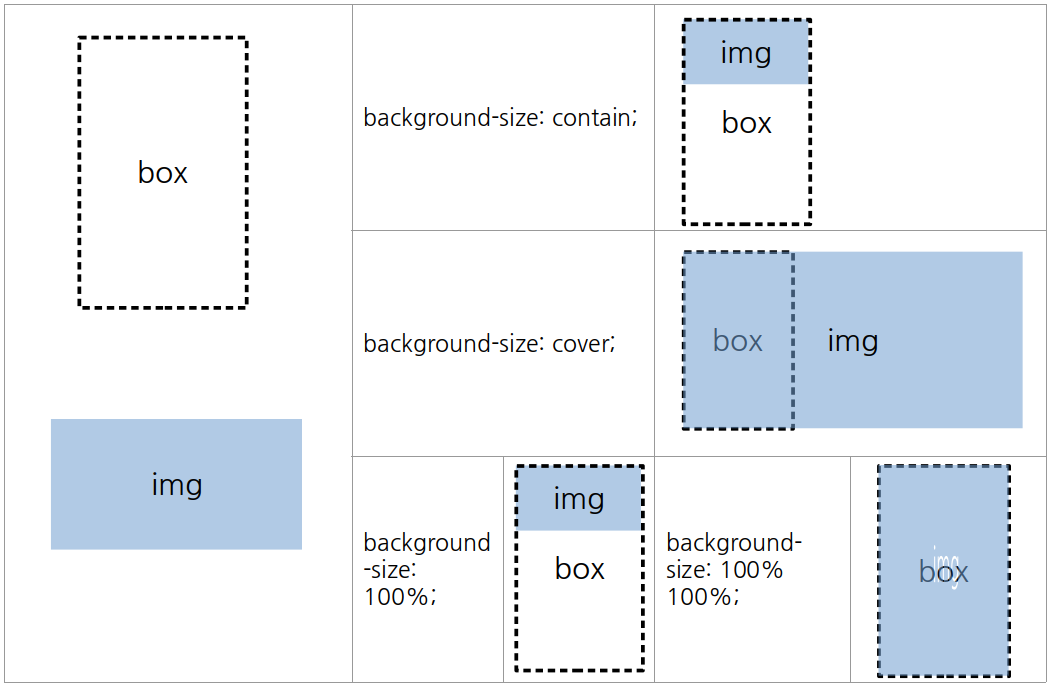
A background-size property sizes the image to fit inside the background.
It can take length(100px or 10em) percentage(100%) values, or keywords(cover, contain).
- length, percentage values : 지정한 크기로 이미지를 scale
- 값을 하나로 지정 : image의 aspect ratio 유지, width를 그 값으로 설정
- 두 개로 지정 : aspect ratio 무시, width, height를 설정(1000px 등으로 크게 설정하면 box 바깥으로 나감)
cover: aspect ratio 유지, box가 채워지도록 크기 조정- image 잘릴 수 있음
- box가 세로로 길 경우
background-size: 100%;는 width를 맞추기 때문에 밑에 빈공간이 남을 수 있지만,cover는 height를 100%로 맞춰서 box를 채움
contain: aspect ratio 유지, image가 box안에 들어오도록 설정(이미지가 작으면 확대함)
Box, image aspect ratio에 따른 size 설정
box의 ratio > image의 ratio

box의 ratio < image의 ratio
Positioning the background image
The background-position property set the position of the background image on the box.
The top-left-hand corner of the box has coordinate (0, 0)(it is also the default background-position value).
The most common background-position values take two individual values(a horizontal value followed by a vertical value).
It can take lengths, percentages, and keywords(top, bottom, right, left, center).
background-position 은 background-position-x, background-position-y의 shorthand임에 유의
Example
1
2
3
4
background-position: top center;
background-position: 20px 10%;
background-position: 20px top;
background-position: top 20px right 10px;
- lengths, percentages : 하나만 적을 경우 horizontal로 적용되고 vertical은 center로 설정됨
- keywords :
top center로 적든center top으로 적든 알아서 적용됨(center는 horizontal, vertical에 둘다 적용가능하지만 나머지는 같은 축끼리 쓰면 적용안됨) - keywords와 lengths or percentages를 섞어서 사용할 수 있음
top 20px right 10px(위에서 20px, 오른쪽에서 10px 떨어지게 위치)와 같이 4-value syntax도 사용 가능
Gradient backgrounds
A gradient - when used for a background - acts just like an image and is also set by using the background-image property.
Example
1
2
3
4
background-image: linear-gradient(105deg, rgba(0,249,255,1) 39%, rgba(51,56,57,1) 96%);

background-image: radial-gradient(circle, rgba(0,249,255,1) 39%, rgba(51,56,57,1) 96%);
background-size: 100px 100px;
- We can set the size of gradients with the
background-size, and the gradients will be repeated by default.
Multiple background images
It is possible to have multiple background images in a single property value, by separating with commas.
Example
1
2
3
background-image: url(image1.png), url(image2.png), url(image3.png), url(image4.png);
background-repeat: no-repeat, repeat-x, repeat;
background-position: 10px 20px,  top right;
- The last listed image will be at the bottom layer.
- The other
background-*properties can also have comma-separated values. - comma로 구별된 대로 properties가 부여되지만, 수가 맞지 않은 경우 property가 반복됨(위의 경우 position value가 순서대로 반복 -> image3은
10px 20px;, image 4는top right;)
Background attachment
The background-attachment property can controll how the backgrounds scroll when the content scrolls.
It can take the following values:
scroll: background를 element box에 고정 => element scroll은 background를 움직이지 않음(딸려 올라가지 않음), page scroll은 움직임(딸려 올라감)fixed: background를 viewport에 고정 => element scroll, page scroll 둘 다 background를 움직이지 않음local: background를 element content에 고정 => element scroll, page scroll 둘 다 background를 움직임
Using the background shorthand property
We can specify backgrounds by the shorthand background.
A few rules to use shorthand values:
- if using multiple backgrounds, separate them by comma
background-color(solid background) may only be specified after the final comma- the value of
background-sizemust be included immediately afterbackground-position, separated with the/character, such ascenter / 80%
Example
1
2
3
4
5
6
.box {
  background:
    linear-gradient(105deg, rgba(255,255,255,.2) 39%, rgba(51,56,57,1) 96%) center center / 400px 200px no-repeat,
url(big-star.png) center no-repeat,
    rebeccapurple;
}
Accessibility considerations with backgrounds
If specifying an image, and text will be placed on top of that image, you should also specify a background-colorto make the text to be legible whenever the image loaded or not.
Screen readers cannot parse background images, therefore they should be purely decoration; any important content should be part of the HTML page and not contained in a background.
Borders
Typical usage는 위에서 말한 그대로임
Rounded corners
The border-radius property gives a box rounding corners.
Associated longhands : border-top-left-radius, border-top-right-radius, border-bottom-right-radius, border-bottom-left-radius.(clockwise)
Two lengths or percentages can be used as a value, the horizontal radius and vertical radius(horizontal radius는 border의 width 중 둥글어지는 길이를 나타냄, vertical은 height 중).
border-radius로 horizontal, vertical까지 설정할 수 없음(값 여러 개 입력하면 longhand에 대한 입력을 들어감, 8개 넣으면 적용안됨)
Handling different text directions
What are writing modes?
A writing mode in CSS refers to whether the text is running horizontally or vertically.
The writing-mode property switch from one writing mode to another.
The three possible values for the writing-mode:
horizontal-tb: top-to-bottom block flow direction, horizontal sentencesvertical-rl: right-to-left block flow direction, vertical sentencesvertical-lr: left-to-right block flow direction, vertical sentences
Writing modes and block and inline layout
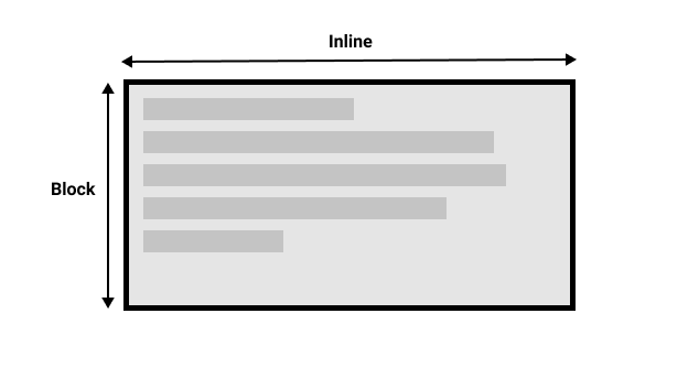
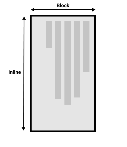
In writing-mode: horizontal-tb, sentences flow horizontally and blocks are displayed vertically, and vice versa.
When we switch the writing mode, the directions of inline, block is changed.
The directions are also called as dimensions.
The block dimension is always the direction blocks are displayed on the page, and the inline dimension is always the direction a sentence flows.
| horizontal writing mode | vertical writing mode |
|---|---|
 |
 |
Direction
Arabic과 같이 horizontal하지만 right-to-left로 읽고 쓰는 언어도 있음 -> 이런 언어들도 있기 때문에 newer CSS layout methods들은 텍스트의 start와 end도 지정함
Logical properties and values
A lot of properties are tied to the physical dimensions of the screen, and make most sense when in a horizontal writing mode.
Example
CSS:
1
2
3
4
5
6
7
8
9
10
11
.box {
  width: 150px;
}

.horizontal {
  writing-mode: horizontal-tb;
}

.vertical {
  writing-mode: vertical-rl;
}
HTML:
1
2
3
4
5
6
7
8
9
10
11
12
<div class="wrapper">
  <div class="box horizontal">
    <h2>Heading</h2>
    <p>A paragraph. Demonstrating Writing Modes in CSS.</p>
    <p>These boxes have a width.</p>
  </div>
  <div class="box vertical">
    <h2>Heading</h2>
    <p>A paragraph. Demonstrating Writing Modes in CSS.</p>
    <p>These boxes have a width.</p>
  </div>
</div>
| Result: |
|---|
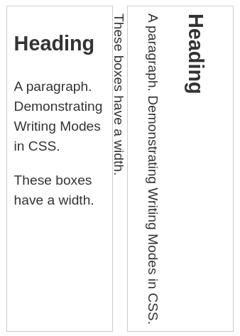 |
In the example above, the box with a vertical writing mode still has a width, and this causing the text to overflow.
It is needed to swap height and width along with the writing mode. For example, when we’re in a vertical writing mode we want the box to expand in the block dimension.
=> CSS developed a set of mapped properties which replace physical properties with logical, or flow relative versions.
inline-size- a property mapped to
widthwhen in a horizontal writing mode - sizes the inline dimension
- a property mapped to
block-size- a property mapped to
heightwhen in a horizontal writing mode - sizes the block dimension
- a property mapped to
inline-size: 150px;를 이용하면 위에서와 같이 vertical writing mode를 이용하더라도 horizontal과 같이 너비 설정이 제대로 적용됨

Logical margin, border, and padding properties
There are many instances of physical properties, for example, margin-top, padding-left, and border-bottom.
In the same way for width and height, there are mappings for these properties.
*-topmapped to*-block-start*-rightmapped to*-inline-start*-bottommapped to*-block-end*-leftmapped to*-inline-end
Logical values
There are also logical mappings for values like top, right, bottom, and left.
They are same with the words above.
※ chrome, edge는 float property에 대해 flow relative values 지원 안함, firefox만 하는중
Should you use physical or logical properties?
The logical properties and values have only recently been implemented in browsers. Therefore you have to check how far back the browser support goes before you use the logical values. For now, you prefer to use the physical versions unless using multiple writing modes. However, most things will transition to the logical versions when we start dealing with layout methods such as flexbox and grid.
Overflowing content
What is overflow?
Everything in CSS is a box. Overflow happens when there is too much content to fit in a box.
CSS tries to avoid “data loss”
If we restrict the width or height of a box, there may be overflow. However CSS does not hide content wherever possible, regardless of overflow. This is because of data loss. The problem with data loss is that you and visitors may not notice.
Instead, CSS overflows in visible ways. Then you or visitors will know that content is overlapping.
CSS assumes that you are managing the potential for overflow. In general, restricting the block dimension is problematic when the box contains text. There may be more text than you expected when designing the site, or the text may be larger.
We can control sizing in ways that are less prone to overflow. However, if a fixed size needed, we can also control how the overflow behaves.
The overflow property
The overflow property instruct the browser how it should behave.
It can take the following values:
visible: default valuehidden: crop content when it overflows(= hide overflow)scroll: add scrollbars always(even when it doesn’t overflow)auto: add scrollbars when it overflows(block dimension으로만)
There are also longhand properties overflow-x, overflow-y
- x or y축만 스크롤바 생김, 잘못 설정하면 스크롤이 아예 안되고 data loss일어남
- shorthand로 쓸 경우 x부터 설정
- 여기서 x, y는 vertical writing mode라도 고정임
If you have a long word in a small box, consider using the word-break or overflow-wrap.
word-break:normal,break-all,keep-all,break-word4개의 value를 가짐normal: 긴 단어 보존(overflow), CJK(Chinese, Japanese, Korean)는 box에 맞춤break-all: 모든 언어들에 대해 box에 맞춤keep-all: 모든 언어들에 대해 그대로 보존break-word:normal과 비슷, 요새 쓰지 않음
overflow-wrap:normal,anywhere,break-word3개의 value를 가짐
Overflow establishes a Block Formatting Context
overflow property에 scroll, auto, hidden을 사용하면 그 element에 Block Formatting Context(BFC)가 생성됨
BFC가 생성되면 그 안에 있는 모든 element들은 BFC가 생성된 element의 box안에 속하게 됨(float여도 속함)
밖에서 BFC가 생성된 element 안으로도 다른 element가 침범할 수 없음
Unwanted overflow in web design
When developing a site, always keep overflow in mind. Generally ensure that your CSS works in a robust way.
CSS values and units
Every property used in CSS has a value type defining the set of values that are allowed for that property.
What is a CSS value?
- CSS specification이나 MDN property pages에서, 각 property에 대해 사용가능한 value type을
<color>,<length>와 같이 명시해놓음 - CSS values are also referred to as data types
- value types는 property와 구분을 위해서 angle brackets를 사용함(e.g.
color,<color>과 같이), html elements와 헷갈리지 않게 주의! - If you see
<color>as valid, you can use all the values in<color>(assuming your browser support them)
Numbers, lengths, and percentages
Numeric value types:
| Data type | Description | Example |
|---|---|---|
<integer> |
whole number | 1024 or -55 |
<number> |
decimal number(+fractional componenet) | 0.255, 128, -1.2 |
<dimension> |
<number> with a unit attachedan umbrella category that includes the <length>, <angle>, <time>, and <resolution> types |
45deg, 5s, 10px |
<percentage> |
fraction of some other value | 50% |
Lengths
There are two types of lengths, relative and absolute.
Absolute length units
These are always the same size.
| Unit | Name | Equivalent to |
|---|---|---|
cm |
Centimeters | 1cm = 38px |
mm |
Millimeters | 1mm = 1/10th of 1cm |
Q |
Quarter-millimeters | 1Q = 1/40th of 1cm |
in |
Inches | 1in = 96px |
pc |
Picas | 1pc = 1/6 of 1in |
pt |
Points | 1pt = 1/72th of 1in |
px |
Pixels | 1px = 1/96th of 1in |
The only value that you will commonly use is px.
Relative length units
These are relative to something else, perhaps the size of the parent element’s font.
| Unit | Relative to |
|---|---|
em |
Font size of the parent in the case of typographical properties like font-size, font size of the element itself in the case of other properties like width |
ex |
x-height of the element’s font |
ch |
The advance measure(width) of the glyph “0” of the element’s font |
rem |
Font size of the root element |
lh |
Line height of the element |
vw |
1% of the viewport’s width |
vh |
1% of the viewport’s height |
vmin |
1% of the viewport’s smaller dimension |
vmax |
1% of the viewport’s larger dimension |
ex는em의 절반rem은 root element의 font-size 기준,em는 parent의 font-size 기준 -> nested element의 경우em으로 글자설정하면 계속 커짐!
Percentages
Percentages are always set relative to some other value.
For example, font-size: 110%; sets the font size to 110% of its parent’s font size.(similar to em)
- 보통 부모 element의 값을 기준으로함
<length>만 사용가능한 element가 있음(<length-percentage>가 사용가능하면 percentage도 사용가능,<length>면 percentage는 불가능)
Numbers
Some value types accept numbers, without any unit added to them.
For example, opacity property accepts a unitless number. 0(fully transparent) to 1(fully opaque).
opacity: 0.6;
※ A number as a value in CSS should not be surrounded in quotes.
Color
There are many ways to specify color in CSS.
The standard color system is 24bit, 16.7 million(256 x 256 x 256) colors.
Color keywords
simple and understandable
rebeccapurple
Hexadecimal RGB values
Each hex value consists of a hash/pound symbol(#) followed by six hexadecimal numbers(0 to f)
#ffdead
RGB and RGBA values
These are functions.
rgb(R, G, B) : represents RGB channel values by decimal numbers(0 to 255)
rgba(R, G, B, a) : similar to rgb() but alpha channel added(0 : fully transparent, 1 : fully opaque)
- property
opaque는 element 전체의 opacity를 설정하는 반면rgba()의 alpha value는 설정한 색에 대해서만 투명도를 설정함! rgba()와rgb(),hsl()과hsla()은 언제부턴가 서로 완전히 같은 함수로 작동함(rgb에 a 붙여서 사용해도 정상작동) 따라서 아무거나 써도 상관없지만, transparent color가 정의되어있다는 것을 표현하기 위해 rgba를 사용하는 것이 좋음
HSL and HSLA values
hsl(Hue, Saturation, Lightness) is slightly less well-supported than RGB.
- Hue(색조)
- The base of the color
- [0, 360], representing the angles around a color wheel(
0: red,120: green,240: blue)
- Saturation(채도)
- How saturated is the color?
- [0, 100] (%),
0%is no color(shade of grey),100%is full color saturation
- Lightness(밝기)
- How light or bright is the color?
- [0, 100] (%),
0%is no light(completely dark),100%is full light(completely white)
Images
The <image> value type is used wherever an image is a valid value.
This can be an actual image file pointed to via a url() function, or a gradient(e.g. linear-gradient()).
Position
The <position> value type represents a set of 2D coordinates.
It can take keywords such as top, left, bottom, right, and center.
It aligns items with specific bounds of a 2D box, along with lengths, which represent offsets from the top and left-hand edges of the box.
- consists of two values - the horizontal position, the vertical position.
- 하나의 축에 대해서만 값을 지정할 경우 나머지 하나는
center로 default됨 right 40px: right, 40 from the top
Strings and identifiers
Keywords(red, black, …) are more accurately described as identifiers.
You can use strings(double quotes) when specifying generated content(in pseudo-element).
Functions
In CSS, functions exist as property values, such as rgb(), hsl(), url().
A calc() does simple calculations inside CSS.
e.g. calc(20% + 100px)
Sizing items in CSS
The natural or intrinsic size of things
- Intrinsic size : a size defined by its content
- empty
<div>는 스스로의 크기가 없음
-><div>만 선언할 경우 하나의 선으로 나타남(block level element이기 때문에 width는 parent element의 width와 같지만 height는 없음
-> 안에 text를 추가하면 사이즈가 생기고, 이게<div>의 instric size임(안의 content에 의해 결정된 size)
Setting a specific size
- Extrinsic size : a size given to an element, by
widthandheightvalues - Because of overflow, fixing the height with lengths or percentages need to be done carefully
Using percentages
Percentages resolve against the size of the containing block.
Percentage margins and padding
When you set margin and padding in percentages, the value is calculated from the inline size of the containing block.
margin: 10%; padding: 10%;: margins, paddings 모두 width의 10%(horizontal writing mode일 때)
min- and max- sizes
min-height property makes the box to be always at least the height.
A common use of max-width is to cause images to scale down if there is not enough space to display them at their intrinsic width while making sure they don’t become larger than that width.
Example
CSS:
1
2
3
4
5
6
7
8
9
10
11
12
.box {
  width: 200px;
}
.minibox {
  width: 50px;
}
.width {
  width: 100%;
}
.max {
  max-width: 100%;
}
HTML:
1
2
3
4
5
<div class="wrapper">
  <div class="box"><img src="star.png" alt="star" class="width"></div>
  <div class="box"><img src="star.png" alt="star" class="max"></div>
  <div class="minibox"><img src="star.png" alt="star" class="max"></div>
</div>
| Result: |
|---|
 |
max-width: 100%를 이용하면 이미지를 responsive하게 만들면서 크기를 박스 이상으로 커지지 않게 만들 수 있음
Viewport units
Viewport : the visible area of your page in the browser you are using to view a site
vw
- unit for viewport width
1vwis equal to 1% of the viewport width
vh
- unit for viewport height
1vhis equal to 1% of the viewport height
Viewport units can be useful in your designs(e.g. hero section: set width to 100vh)
box-sizing: border-box일 경우 alternative box model이 적용되기 때문에width: 60%;,padding: 10%;를 적용하면 width는 60% 그대로 남고 height만 증가함
Images, media, and form elements
Replaced elements
Certain replaced elements(images, video) have an aspect ratio as default.
Sizing images
box라는 <div>안에 <img>를 넣어놓은 상태
box에 width: 100px;를 적용하고 img를 넣으면 overflow할 수도 있음(이미지가 작은 경우에는 이미지가 늘어나진 않음)
=> img에 max-width: 100%;를 적용하면 이미지가 box보다 더 클 경우 box의 너비에 맞춰짐
object-fit property
object-fit: cover;를 img에 적용시키면 img가 box를 꽉 채움(aspect ratio를 유지)object-fit: contain;를 img에 적용시키면 img가 box안에 들어감(aspect ratio를 유지하면서 들어가기 때문에 box에 빈 공간이 남음)
Example
CSS:
1
2
3
4
5
6
7
8
9
10
11
12
13
14
15
16
17
.box {
  width: 200px;
  height: 200px;
}

img {
  height: 100%;
  width: 100%;
}

.cover {
  object-fit: cover;
}

.contain {
  object-fit: contain;
}
HTML:
1
2
3
4
<div class="wrapper">
  <div class="box"><img src="balloons.jpg" alt="balloons" class="cover"></div>
  <div class="box"><img src="balloons.jpg" alt="balloons" class="contain"></div>
</div>
| Result: | |
|---|---|
 |
- img의
width,height를 둘 다 100%로 설정해놓은 상태라object-fit속성을 선언해놓지 않으면 box를 채움(object-fit: fill;과 같음, img의 aspect ratio를 무시하고 box를 채워버림)
Replaced elements in layout
In a flex or grid layout, elements are stretched by default to fill the entire area.
Images will not stretch, and instead will be aligned to the start of the grid area or flex container.
To force the image to stretch to fill the grid cell it is in,
1
2
3
4
img {
  width: 100%;
  height: 100%;
}
Form elements
<input>, <textarea>, <fieldset>, <legend> 등을 이용해 form controls를 더할 수 있음
Styling text input elements
<input type="text">, <textarea>와 같은 elements는 다른 것들과 비슷함
input[type="text]와 같이 selector를 선언하여 css를 적용할 수 있음
form elements는 os, browser마다 다르게 렌더링하기 때문에 다양한 환경에서 테스트 필요
Inheritance and form elements
In some browsers, form elements do not inherit font styling by default. Therefore if you want to be sure that your form fields use the font defined on the body, or on a parent element, you should add this rule to your CSS.
1
2
3
4
5
6
7
button,
input,
select,
textarea {
  font-family: inherit;
  font-size: 100%;
}
Form elements and box-sizing
Across browsers form elements use different box sizing rules for different widgets.
For consistency it is a good idea to set margins and padding to 0 on all elements, then add these back in when styling particular controls.
1
2
3
4
5
6
7
8
button,
input,
select,
textarea {
  box-sizing: border-box;
  padding: 0;
  margin: 0;
}
Other useful settings
1
2
3
textarea {
  overflow: auto;
}
Putting it all together into a “reset”
We can wrap up the various properties discussed above into the following “form reset” to provide a consistent base to work from.
1
2
3
4
5
6
7
8
9
10
11
12
13
button,
input,
select,
textarea {
  font-family: inherit;
  font-size: 100%;
  box-sizing: border-box;
  padding: 0; margin: 0;
}

textarea {
  overflow: auto;
}
지금은 browsers가 typically consistent하기 때문에 예전만큼 normalizing이 중요하지는 않음
normalize.css에서 다른 base stylesheet 확인 가능
Testing your skills
img에 object-fit property를 적용할 때 width, height가 설정되어 있어야 함
object-fit는 width, height가 정해졌을 때 img의 aspect ratio를 기준으로 cover, fill, contain을 설정하는 것임
<div> 안에 <img>를 aspect ratio를 유지하면서 div를 채우게 하려면 width, height를 100%로 설정한 다음 object-fit: cover;를 적용해야함
- 둘 다 설정하지 않으면 img의 원래 화질대로 나옴
- width, height 중 하나만 설정해놓으면 aspect ratio에 맞춰서 img의 크기가 정해짐 =>
object-fit: cover;가 적용되지 않음 - img를 nest하는 것과 background로 넣는 것 이렇게 두 가지 방법이 있음
- img를 nest할 경우 default position이 center
- background로 넣을 경우 default position이 0 0
object-position,background-positionproperty로 설정 가능
img같은 replaced elements의 overflow 관련 property는 overflow를 일으키는 요소에 적용하는게 아니라 부모 요소에 적용해야함
cf. text의 overflow는 <p>같은 element에 직접 적용함
Styling tables
A typical HTML table
scope attribute, <caption>, <thead>, <tfoot> 등을 이용해서 HTML table markup 가능
=> cramped
Styling our table
1
2
3
4
5
6
7
8
9
10
11
12
13
14
15
16
17
18
19
20
21
22
23
24
25
26
table {
  table-layout: fixed;
  width: 100%;
  border-collapse: collapse;
  border: 3px solid purple;
}

thead th:nth-child(1) {
  width: 30%;
}

thead th:nth-child(2) {
  width: 20%;
}

thead th:nth-child(3) {
  width: 15%;
}

thead th:nth-child(4) {
  width: 35%;
}

th, td {
  padding: 20px;
}
table에table-layout: fixed;를 적용하면 첫 번째 row를 기준으로 column width가 고정됨
=> subsequent rows에서 width가 맞지 않을 수 있음,overflowproperty를 이용해서 조절해야함
cf.table-layout: auto;가 default, 자동으로 열 너비 설정함(overflow 발생하지 않게)fixed로 설정하면 table headings를 이용해서 열 너비 설정 가능thead th:nth-child(n)selector를 이용해서 table headings의 width를 설정table의 width를 100%로 설정, th들은 table의 width를 나눠가짐(30%, 20%, 15%, 35%)table에border-collapse: collapse;를 사용하면 중복되는 테두리가 하나만 나타남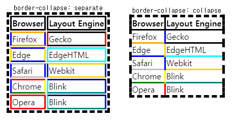
th,td에 padding 추가 => 가독성 증가
Some simple typography
1
2
3
4
5
6
7
8
9
10
11
12
13
14
15
16
17
18
19
20
21
22
23
html {
  font-family: 'helvetica neue', helvetica, arial, sans-serif;
}

thead th, tfoot th {
  font-family: 'Rock Salt', cursive;
}

th {
  letter-spacing: 2px;
}

td {
  letter-spacing: 1px;
}

tbody td {
  text-align: center;
}

tfoot th {
  text-align: right;
}
letter-spacing: 자간
Graphics and colors
1
2
3
4
5
6
7
8
9
10
thead, tfoot {
  background: url(leopardskin.jpg);
  color: white;
  text-shadow: 1px 1px 1px black;
}

thead th, tfoot th, tfoot td {
  background: linear-gradient(to bottom, rgba(0,0,0,0.1), rgba(0,0,0,0.5));
  border: 3px solid purple;
}
text-shadow: 1px 1px 1px black;: offset-x, offset-y, blur-radius, color- multiple backgrounds, linear gradients를 지원하지 않는 browsers를 위해 background를 분리해서 넣음
Zebra stripping
1
2
3
4
5
6
7
8
9
10
11
12
13
14
15
tbody tr:nth-child(odd) {
  background-color: #ff33cc;
}

tbody tr:nth-child(even) {
  background-color: #e495e4;
}

tbody tr {
  background-image: url(noise.png);
}

table {
  background-color: #ff33cc;
}
nth-child([odd/even])으로 홀수/짝수 행 선택 가능, formula(2n-1,2n과 같이)도 인자로 넣을 수 있음- 맨 마지막
table의 background는nth-childpseudo-class selector를 지원하지 않는 browser을 위한 것
Styling the caption
caption-side: bottom;을 통해서 caption의 위치 지정 가능
Table styling quick tips
- Make your table markup as simple as possible, and keep things flexible, e.g. by using percentages, so the design is more reponsive.
- Use
table-layout: fixed;
to create a more predictable table layout that allows you to easily set column widths by settingwidthon their headings(<th>). - Use
border-collapse: collapse;
to make table elements borders collapse into each other, producing a neater and easier to control look. - Use
<thead>,<tbody>, and<tfoot>
to break up your table into logical chunks and provide extra places to apply CSS to, so it is easier to layer styles on top of one another if required. - Use zebra striping to make alternative rows easier to read.
- Use
text-align
to line up your<th>and<td>text, to make things neater and easier to follow
Test your skills
CSS:
1
2
3
4
5
6
7
8
9
10
11
12
13
14
15
16
17
18
19
20
21
22
23
24
25
26
27
28
29
30
31
32
33
34
35
36
37
38
39
th, td {
  padding: 5px;
}

tr :nth-child(2),
tr :nth-child(3) {
  text-align: right;
}

tr :nth-child(1),
tr :nth-child(4) {
  text-align: left;
}

tfoot tr :nth-child(1) {
  text-align: right;
}

tfoot tr :nth-child(2){
  text-align: left;
}

table {
  border-collapse: collapse;
  border-top: 1px solid #eeeeee;
}

tfoot {
  border-top: 1px solid #eeeeee;
  border-bottom: 1px solid #eeeeee;
}

tbody tr:nth-child(odd) {
  background: #eeeeee;
}

thead {
  vertical-align: top;
}
HTML:
1
2
3
4
5
6
7
8
9
10
11
12
13
14
15
16
17
18
19
20
21
22
23
24
25
26
27
28
29
30
31
32
33
34
35
36
37
38
39
40
41
42
43
44
45
46
47
48
49
50
51
52
53
54
55
56
57
58
59
60
61
62
63
64
65
66
67
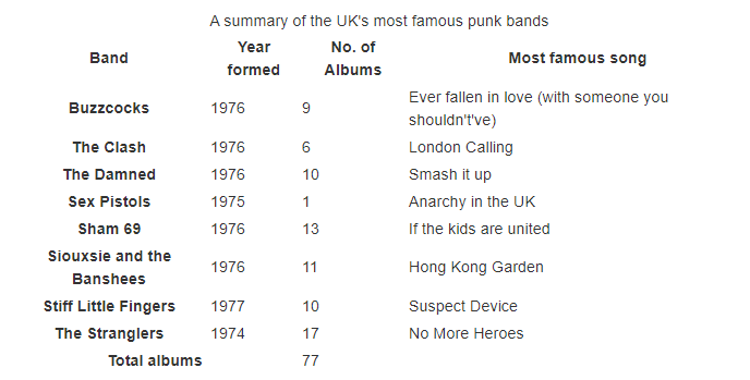
<table>
<caption>A summary of the UK's most famous punk bands</caption>
<thead>
<tr>
<th scope="col">Band</th>
<th scope="col">Year formed</th>
<th scope="col">No. of Albums</th>
<th scope="col">Most famous song</th>
</tr>
</thead>
<tbody>
<tr>
<th scope="row">Buzzcocks</th>
<td>1976</td>
<td>9</td>
<td>Ever fallen in love (with someone you shouldn't've)</td>
</tr>
<tr>
<th scope="row">The Clash</th>
<td>1976</td>
<td>6</td>
<td>London Calling</td>
</tr>
<tr>
<th scope="row">The Damned</th>
<td>1976</td>
<td>10</td>
<td>Smash it up</td>
</tr>
<tr>
<th scope="row">Sex Pistols</th>
<td>1975</td>
<td>1</td>
<td>Anarchy in the UK</td>
</tr>
<tr>
<th scope="row">Sham 69</th>
<td>1976</td>
<td>13</td>
<td>If the kids are united</td>
</tr>
<tr>
<th scope="row">Siouxsie and the Banshees</th>
<td>1976</td>
<td>11</td>
<td>Hong Kong Garden</td>
</tr>
<tr>
<th scope="row">Stiff Little Fingers</th>
<td>1977</td>
<td>10</td>
<td>Suspect Device</td>
</tr>
<tr>
<th scope="row">The Stranglers</th>
<td>1974</td>
<td>17</td>
<td>No More Heroes</td>
</tr>
</tbody>
<tfoot>
<tr>
<th scope="row" colspan="2">Total albums</th>
<td colspan="2">77</td>
</tr>
</tfoot>
</table>
| Result: | |
|---|---|
| Before | After |
 |
 |
th, td에 padding을 줘서 셀 넓힐 수 있음:nth-child(n): element 상관없이 세었을 때 n번째 자식들td:nth-child(n): element 상관없이 세었을 때 n번째 자식이면서td인 element들:nth-of-type(n): element type별로 세었을 때 n번째 자식들td:nth-of-type(n): element type별로 세었을 때 n번째 자식이면서td인 element들vertical-alignproperty를 사용해서 box에서 text의 세로 위치를 결정할 수 있음(top,middle,bottom)
Debuging CSS
How to access browser DevTools
firefox devtools는 grid layouts, flexbox, shapes를 edit할 수 있다
The DOM versus view source
DOM에는 HTML의 오류들이 수정되어서 렌더링됨(browser에 의해) (+ browser가 모든 HTML을 normalize하고, DOM에는 JavaScript에 의한 변경점도 모두 적용됨)
View Source는 DevTools에 의해 지원되는, 서버에 저장된 HTML source code를 보여주는 것임
(+ HTML tree도 같이 보여줌, display되지 않은 elements까지 볼 수 있음)
Inspecting the applied CSS
Rules view에서 element에 적용된 모든 CSS를 볼 수 있음(inherited 포함)
shorthand properties를 longhand properties로 확장할 수 있음
toggle하여 rule을 적용하거나 제외할 수 있음
Editing values
CSS를 볼 뿐만 아니라 propertie values를 수정 가능함
Adding a new property
closing curly brace를 클릭하면 new declaration 삽입 가능
Understanding the box model
Layout view에서는 element의 크기를 자세히 볼 수 있음
box-sizing에 따라 box의 크기를 계산해서 표시해줌(box-sizing, display 등의 box model properties를 포함해서)
Solving specificity issues
more specific selector가 존재하는 경우 css를 수정해도 적용이 안됨
DevTools에서 하나의 element에 대해 어떤 value가 적용되고 있는지 알 수 있음(specificity 순으로 나열됨)
Debugging problems in CSS
Few steps to solve problems:
- Take a step back from the problem
- Do you have valid HTML and CSS?
- use validator
- Is the property and value supported by the browser you are testing in?
- DevTools will generally highlight unsupported properties and values in some way.
- Is something else overriding your CSS?
- use DevTools to find overriding rules.
-
Make a reduced test case of the problem reduced test case : code example that demonstrates the problem in the simplest possible way, with unrelated surrounding content and styling removed.
To create a reduced test case:
- If your markup is dynamically generated, make a static version of the output that shows the problem.
- 이슈와 관련 없는 JavaScript 제거
- 이슈와 관련 없는 HTML 제거(main element까지도)
- 이슈와 관련 없는 CSS 제거
reduced test case를 만들면 문제의 원인이나 트리거 등을 발견할 수 있음 + 도움을 요청할 때 다른 사람이 문제를 더 쉽게 파악 가능
Organizing your CSS
Tips to keep your CSS tidy
Does your project have a coding style guide?
Keep it consistent
Formatting readable CSS
Comment your CSS
- 코드에서 사용하지 않는 문자열을 comment의 index로 사용 가능(
||와 같이)
1
2
3
4
5
6
7
8
9
10
11
/* || General styles */

...

/* || Utilities */

...

/* || Sitewide */

...
Create logical sections in your stylesheet
위 코드처럼 logical section을 만들어놓으면 코드의 가독성이 증가함
/* || General styles */
- elements들에 대한 default styling
/* || UTILITIES */
- nobullets같은 utility classes
/* || Sitewide */
- main-nav, logo같은 basic page layout, header, navigation styling
/* || Store pages */
- 나머지 css
=> 바꿔야 하는 부분을 쉽게 찾을 수 있음
Avoid overly-specific selectors
Break large stylesheets into multiple smaller ones
you can link to multiple stylesheets from one page.
Other tools that can help
CSS methodologies
이미 만들어진 methodologies를 사용하면 협업할 때 편함
OOCSS
Object Oriented CSS
basic idea of OOCSS : to separate your CSS into reusable objects
media와 같이 하나의 class를 정의해 common CSS를 적음
=> 이후 다른 클래스들을 선언해 specific한 CSS 적음
=> media 클래스는 모든 component에 들어가는 클래스
BEM
Block Element Modifier
Block : stand-alone entity e.g. button, menu, logo
Element : e.g. list item, title that is tied to the block it is in
Modifier : flag on a block or element that changes the styling or behavior
extensive use of dashes and underscores in the CSS classes가 특징임
Example
1
2
3
4
5
6
<form class="form form--theme-xmas form--simple">
  <input class="form__input" type="text" />
  <input
    class="form__submit form__submit--disabled"
    type="submit" />
</form>
Other common systems
다른 것들도 많음(SMACSS, ITCSS, ACSS 등등)
이런 system을 쓰면 좋은 점은 가이드가 많아 쉽게 작성 가능하다는 것이고,
나쁜 점은 처음 볼 때 너무 복잡하게 보인다는 것임(특히 작은 프로젝트에서)
Build systems for CSS
Pre-processor runs over your raw files and turns them into a stylesheet
Post-processor takes your finished stylesheet and optimizes it
pre and post-processing을 지원해야 사용 가능(대부분의 IDE 지원)
Sass : the most popular pre-processor
변수 선언, component stylesheets 때문에 많이 쓰임
Defining variables
지금은 CSS에도 custom properties를 이용해서 변수를 선언 가능
Sass에서는 $를 prefix로 붙여서 변수 선언 가능
Example
1
2
3
4
5
$base-color: #c6538c;

.alert {
  border: 1px solid $base-color;
}
Compiling component stylesheets
foundation/_code.scss, foundation/_lists.scss, foundation/_footer.scss, foundation/_links.scss가 foundation 디렉토리 안에 있다고 가정하면
1
2
3
4
5
// foundation/_index.sass
@use 'code'
@use 'lists'
@use 'footer'
@use 'links'
처럼 index를 만들고
1
2
// style.sass
@use 'foundation'
처럼 foundation 디렉토리와 동일한 경로에서는 foundation 디렉토리 전체를 링크 가능
Post-processing for optimization
stylesheets의 크기를 줄이는 등의 최적화를 해줌
Assessment06-Fundamental-CSS-comprehension
line-heightproperty : 줄의 높이 설정(line-height가font-size보다 클 경우 글자는 자동으로 vertically center로 배치됨,vertical-align은 inline element에 대해서만 사용 가능)
p에서 line height가 font size보다 클 때 vertical position 조정은 어떻게 하지?
=> 할 필요가 없음(line-height, padding으로 조정 가능)
Assessment07-Creating-fancy-letterheaded-paper
- background를 넣을 때 fallback을 위에 넣는 이유 : 같은 property에 대해서는 cascading rule이 적용되어서 가장 아래에 적힌 것이 적용되기 때문
filter: drop-shadow(3px 3px 3px black);를 이용filter를 지원하지 않는 브라우저에 대해border-radius: 64px; box-shadow: 3px 3px 3px black;를 사용해서 비슷하게 만들 수 있음- 하지만 박스를 원 형태로 만들어서 그림자를 넣는 것이기 때문에 자연스럽지 않음
Assessment08-A-cool-looking-box
background는 모든 background를 바꿔버리고,background-color,background-image는 기존 background에 각각의 value를 추가함
(background, background-image, background-color 순서로 layer가 정의되어 있는 듯, 앞이 가장 위의 layer)- default font size :
16px <p>의 경우margin: auto;를 넣으면 자동으로 center로 위치가 맞춰짐box-shadow는inset이 적용된 value를 먼저 적는게 더 가독성이 좋음line-height의 기본 단위는em임
Advanced styling effects
Box shadows
box-shadow는 IE9+, Edge등에서도 지원됨
older IE versions에서는 지원안되기 때문에 shadow 없이도 legible한지 테스트해야함
A simple box shadow
box-shadow: [inset] [horizontal offset] [vertical offset] [blur radius] [base color];
- offset은 negative value 가능
inset은 생략 가능(keyword가 적혀있을 때만 inset이 적용됨)
Multiple box shadows
- comma로 separate해서 여러 개의 shadow를 넣을 수 있음
Other box shadow features
inset을 적용하면 박스의 안쪽에 그림자 넣을 수 있음- inset을 적용하지 않고 offset에 음수 넣은 shadow는 box 아래의 layer에 있어서 box가 덮어버림
text-shadow에는insetkeyword가 없음
- pseudo-class와 함께 사용하면 클릭시 효과를 넣을 수 있음(
:focus,:hover,:active등) [blur radius]뒤에[spread radius]를 넣을 수 있음, 넣은 만큼 shadow를 더 넓혀줌(shadow의 width, height에 spread radius만큼 더함)
Filters
filter property의 value
drop-shadow()blur([blur radius])grayscale(<percentage>)contrast(<percentage>): 퍼센트 만큼 대조invert(<percentage>): 퍼센트 만큼 반전huerotate([angle]): hue값을[angle]만큼 수정함
※ filter의 option 중 몇 개는 css features와 비슷한 효과를 줌
e.g.
drop-shadow는 box-shadow, text-shadow와 비슷함
그러나 border가 dashed인 <p>가 있으면 drop-shadow는 그림자가 점선으로 나타나지만,
box-shadow는 그림자가 실선으로 나타남
Blend modes
blend mode는 background-blend-mode, mix-blend-mode 두 가지로 지원됨
※ blend mode는 최신 기능이라 edge에서는 지원 안됨
background-blend-mode
background-blend-mode: multiply;가 적용되면 background가 여러 개 있을 때 최종 결과는 포토샵으로 섞은 것처럼 나옴
아래 그림의 왼쪽이 이미지와 초록색 배경을 적용한 것, 오른쪽이 blend mode 적용시킨 것
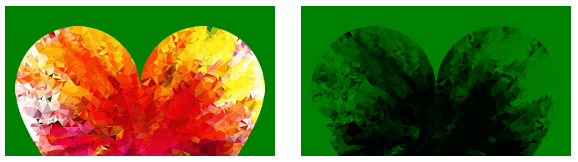
mix-blend-mode
background-blend-mode와 같은 효과지만, <div>와 같은 elements가 blend됨
blend mode가 적용된 element는 다른 element와 겹쳐지면 blend됨
CSS shapes
shape-outside로 이미지가 실제론 직사각형이어도 한글에서 글에 둘러싸이는 것처럼 만들 수 있음- floated elements에 대해서만 적용 가능함
Example
CSS:
1
2
3
4
img {
  float: left;
  shape-outside: circle(50%);
}
HTML:
1
2
3
4
<div class="wrapper">
  <img src="round-balloon.png" alt="balloon">
  <p>One November night in the year 1782, so the story runs, two brothers sat over their winter fire in the little French town of Annonay, watching the grey smoke-wreaths from the hearth curl up the wide chimney. Their names were Stephen and Joseph Montgolfier, they were papermakers by trade, and were noted as possessing thoughtful minds and a deep interest in all scientific knowledge and new discovery. Before that night—a memorable night, as it was to prove—hundreds of millions of people had watched the rising smoke-wreaths of their fires without drawing any special inspiration from the fact.</p>
</div>
| Result: |
|---|
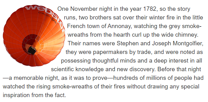 |
circle()은 shape를 만드는 함수 중 하나임(필요하면 더 공부하기)circle(<percentage>)은 이미지의 중심에서부터<percentage>*이미지의 width만큼 원을 그려서 shape으로 활용하는 듯
-webkit-background-clip: text
Example
CSS:
1
2
3
4
5
6
7
8
9
10
11
12
13
14
h2 {
  width: 250px;
  height: 250px;
  text-align: center;
  line-height: 250px;
  font-size: 75px;
  display: inline-block;
  background: url(colorful-heart.png) no-repeat center;
}

.text-clip {
  -webkit-background-clip: text;
  -webkit-text-fill-color: transparent;
}
HTML:
1
2
3
<h2>WOW</h2>

<h2 class="text-clip">WOW</h2>
| Result: |
|---|
 |
- Non-Webkit/Chrome-based browsers도
-webkit-vendor prefix를 붙여서 properties를 사용해야 함- 너무 많이 쓰여서 표준이 아니지만 다른 브라우저도 이 기능을 구현한 결과임
- danger of using non-standard and/or prefixed CSS features

Leave a comment