
CSSnote5: CSS layout
CSS layout
Introduction to CSS layout
The page layout techniques in this module:
- Normal flow
displaypropertyblock,inline,inline-block와 같은 value들은 normal flow에서 element의 layout을 결정grid,flexbox와 같은 value들은 entire layout method를 바꿈(grid나flexbox가 적용된 element 안의 elements들의 layout을 결정)
- Flexbox
- Grid
- Floats
float: left;와 같은 속성을 적용시키면 block level elements가 다른 element의 왼쪽에 떠있게(wrapped)할 수 있음
- Positioning
positionproperty를 이용static,fixed,absolute등의 value를 가짐- box의 위치를 다른 box 안에서 지정하게 해줌
- Table layout
display: table;와 같은 property를 통해 적용시킬 수 있음- non-table elements를 HTML table과 같이 styling하기 위해 만듦
- Multiple-column layout
- block content를 여러 column으로 나타낼 수 있게 해줌
No technique is designed to be used in isolation.
Normal flow
Normal flow : browser가 default로 사용하는 layout HTML code의 순서대로 나타남
- block elements : 이전 순서의 element 아래에 다른 줄로 나타나는 elements
- inline elements : 이전 순서의 element 옆에 같은 줄로 나타나는 elements
=> block direction : block element가 배치되는 방향(writing mode에 따라 결정됨)
The methods that can change how elements are laid out in CSS:
displayproperty- Floats
positionproperty- Table layout
- Multi-column layout
The display property
page layout은 display property를 적용하는 것으로부터 시작됨
예를 들어 <p>의 경우 display: block;가 적용되어있기 때문에 block element로 layout되고, <a>의 경우 display: inline;이 적용되어있기 때문에 inline element로 layout됨
이러한 default display behavior를 바꿀 수도 있음(display에 값을 직접 지정함으로써)
=> HTML elements의 semantic meaning을 직접 지정할 수 있음
display: flex;, display: grid;와 같은, display property를 선언하고 추가적으로 layout을 수정할 수 있는 layout methods도 존재
Flexbox
Flexbox(Flexible Box) : 1차원으로 elements를 편하게 layout하기 위해 만들어짐
display: flex;를 parent element에 적용
=> parent element를 flexbox, child elements를 flex item으로 layout
Example
CSS:
1
2
3
.wrapper {
  display: flex;
}
HTML:
1
2
3
4
5
<div class="wrapper">
  <div class="box1">One</div>
  <div class="box2">Two</div>
  <div class="box3">Three</div>
</div>
| Result: |
|---|
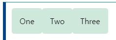 |
- flexbox의
flex-directionproperty에row가 initial value로 들어가있기 때문에 위와 같이 row로 layout됨 - flexbox의
align-itemsproperty에stretch가 initial value로 들어가있기 때문에 item 중 height가 가장 큰 것에 맞춰짐flex-direction: row;이기 때문에 height만 신경쓰면 됨(width는 flex item 각자 값 그대로 들어감)
CSS:
1
2
3
4
5
6
7
.wrapper {
    display: flex;
}

.wrapper > div {
    flex: 1;
}
HTML:
1
2
3
4
5
<div class="wrapper">
  <div class="box1">One</div>
  <div class="box2">Two</div>
  <div class="box3">Three</div>
</div>
| Result: |
|---|
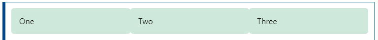 |
- flex items에 적용하는 property도 있음!
flex: 1;을 flex item에 적용하면 공간이 채워지도록 확대/축소할 수 있음- 여러 item에 적용하면 적용된 item들끼리 공간이 채워지도록 조절됨
Grid Layout
Grid : 2차원으로 elements를 layout하기 위해 만들어짐
display: grid;를 parent element에 적용
Example
CSS:
1
2
3
4
5
6
.wrapper {
    display: grid;
    grid-template-columns: 1fr 1fr 1fr;
    grid-template-rows: 100px 100px;
    grid-gap: 10px;
}
HTML:
1
2
3
4
5
6
7
8
<div class="wrapper">
    <div class="box1">One</div>
    <div class="box2">Two</div>
    <div class="box3">Three</div>
    <div class="box4">Four</div>
    <div class="box5">Five</div>
    <div class="box6">Six</div>
</div>
| Result: |
|---|
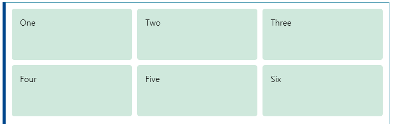 |
grid-template-rows,grid-template-columnsproperties를 사용해서 행, 열 개수 정의
CSS:
1
2
3
4
5
6
7
8
9
10
11
12
13
14
15
16
17
18
19
20
21
.wrapper {
    display: grid;
    grid-template-columns: 1fr 1fr 1fr;
    grid-template-rows: 100px 100px;
    grid-gap: 10px;
}

.box1 {
    grid-column: 2 / 4;
    grid-row: 1;
}

.box2 {
    grid-column: 1;
    grid-row: 1 / 3;
}

.box3 {
    grid-row: 2;
    grid-column: 3;
}
HTML:
1
2
3
4
5
<div class="wrapper">
    <div class="box1">One</div>
    <div class="box2">Two</div>
    <div class="box3">Three</div>
</div>
| Result: |
|---|
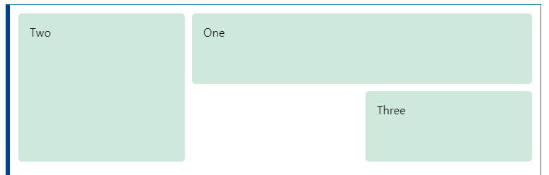 |
grid-column,grid-row를 이용해서 element가 차지할 영역을 지정할 수 있음start/end로 지정, 좌표는 1부터 시작
Floats
하나의 element를 float하면 normal flow에서 제외되고, surrounding content도 같이 float됨
possible values:
left,rightnoneinherit
Example
CSS:
1
2
3
4
5
6
.box {
    float: left;
    width: 150px;
    height: 150px;
    margin-right: 30px;
}
HTML:
1
2
3
4
5
6
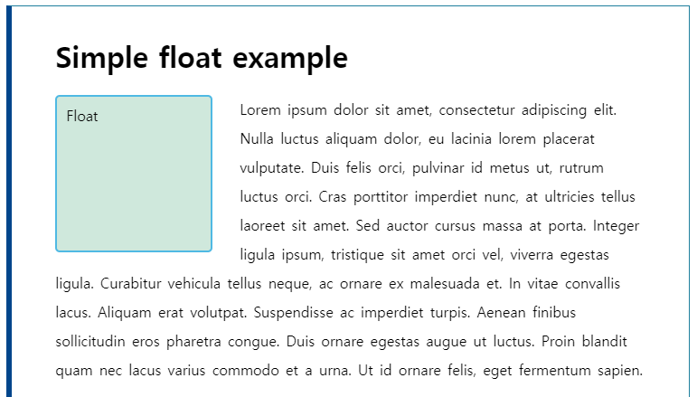
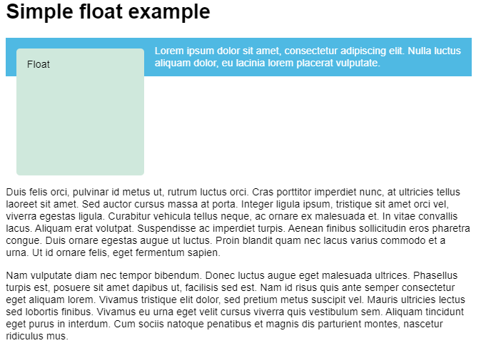
<h1>Simple float example</h1>
<div class="box">Float</div>
<p> Lorem ipsum dolor sit amet, consectetur adipiscing elit. Nulla luctus aliquam dolor, eu lacinia lorem placerat vulputate. Duis felis orci, pulvinar id metus ut, rutrum luctus orci. Cras porttitor imperdiet nunc, at ultricies tellus laoreet sit amet. Sed auctor cursus massa at porta. Integer ligula ipsum, tristique sit amet orci vel, viverra egestas ligula. Curabitur vehicula tellus neque, ac ornare ex malesuada et. In vitae convallis lacus. Aliquam erat volutpat. Suspendisse ac imperdiet turpis. Aenean finibus sollicitudin eros pharetra congue. Duis ornare egestas augue ut luctus. Proin blandit quam nec lacus varius commodo et a urna. Ut id ornare felis, eget fermentum sapien.</p>
| Result: |
|---|
 |
Positioning techniques
Positioning isn’t a method for creating your main page layouts, it is more about managing and fine-tuning the position of specific items on the page.
position property를 이용해서 layout patterns를 만들 수 있음
five types of positioning:
- Static positioning : default
- normal position에 넣음
- Relative positioning
- normal position과 relative하게 position을 지정
- 다른 elements를 overlap하게 지정 가능
- Absolute positioning
- element를 완전히 normal flow에서 제외시킴(다른 layer에 있는 것처럼)
<html>element의 모서리를 기준으로 position을 지정- 자유로운 위치 조정이 필요하거나 복잡한 layout 효과를 만드는데 유용
- Fixed positioning
- browser viewport를 기준으로 position 지정(=> 페이지가 스크롤되어도 고정)
- nav 같이 항상 같은 위치에 있는 것 같은 효과를 만들 때 유용
- Sticky positioning
- defined offset(viewport)에 도달하면
fixed, 이전까지는static인 positioning method
- defined offset(viewport)에 도달하면
Simple positioning example
공통적으로 아래 코드를 이용
positioned class를 이용해서 position property의 value를 하나씩 살펴볼 예정
CSS:
1
2
3
4
5
6
7
8
9
10
11
12
body {
  width: 500px;
  margin: 0 auto;
}

p {
    background-color: rgb(207,232,220);
    border: 2px solid rgb(79,185,227);
    padding: 10px;
    margin: 10px;
    border-radius: 5px;
}
HTML:
1
2
3
4
5
<h1>Positioning</h1>

<p>I am a basic block level element.</p>
<p class="positioned">I am a basic block level element.</p>
<p>I am a basic block level element.</p>
| Result: |
|---|
 |
Relative positioning
Relative positioning을 사용하면
- icon과 같은 것을 text label과 맞추기 위해 원래 위치보다 살짝 아래로 이동시킬 수 있음
CSS:
1
2
3
4
5
6
7
.positioned {
  position: relative;
  background: rgba(255,84,104,.3);
  border: 2px solid rgb(255,84,104);
  top: 30px;
  left: 30px;
}
| Result: |
|---|
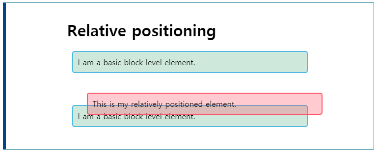 |
top,leftproperties를 이용해서 위치를 지정해줘야 함- element의 원래 위치가 빈 상태로 유지됨(normal flow에 남아있음)
Absolute positioning
containing block의 모서리를 기준으로 위치를 지정함
CSS:
1
2
3
4
5
6
7
.positioned {
    position: absolute;
    background: rgba(255,84,104,.3);
    border: 2px solid rgb(255,84,104);
    top: 30px;
    left: 30px;
}
| Result: |
|---|
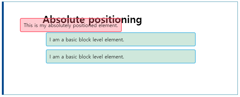 |
top,leftproperties를 이용해서 위치를 지정하는 것은 relative와 비슷하지만, 기준이 다름- 이 예시에서는 page의 top, left가 기준
- 기준을 바꿀 수도 있음
- element의 원래 위치는 유지되지 않음(normal flow에서 제외됨)
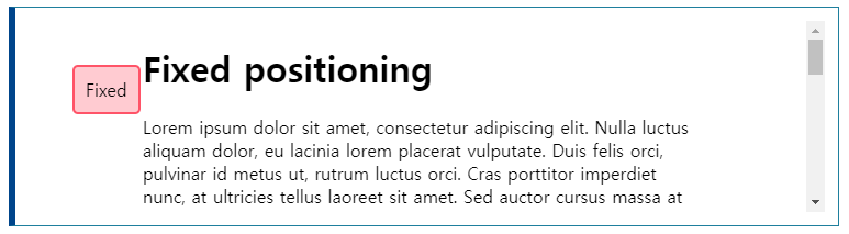
Fixed positioning
Fixed positioning을 사용하면
- top button과 같은 스크롤해도 유지되는 요소 만들 수 있음
CSS:
1
2
3
4
5
.positioned {
    position: fixed;
    top: 30px;
    left: 30px;
}
HTML:
1
2
3
4
5
6
7
<h1>Fixed positioning</h1>

<div class="positioned">Fixed</div>

<p>Paragraph 1.</p>
<p>Paragraph 2.</p>
<p>Paragraph 3.</p>
| Result: |
|---|
 |
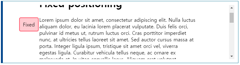 |
- absolute와 마찬가지로 document normal flow에서 제외시킴
- viewport에 relative하게 위치를 지정하기 때문에 스크롤되어도 계속 유지됨
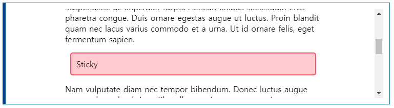
Sticky positioning
element가 viewport의 offset에 도달하기 전까지는 static, 도달해서 걸리면 sticky로 바뀜
CSS:
1
2
3
4
5
.positioned {
  position: sticky;
  top: 30px;
  left: 30px;
}
| Result: |
|---|
 |
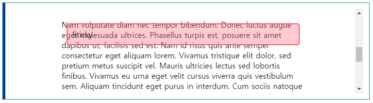 |
- offset을 hit하기 전까지는
static이기 때문에 normal flow에 남아있음(fixed로 바뀐 후에도)
Table layout
CSS가 표준화되기 이전에는 page 자체를 table로 만들었음
=> inflexible, heavy on markup, difficult to debug, semantically wrong
table에 관한 CSS properties는 table이 아닌 elements에도 적용가능함
=> described as using CSS tables
display에 table, table-row, table-cell, table-caption 등의 값을 넣어서 구현
Example
CSS:
1
2
3
4
5
6
7
8
9
10
11
12
13
14
15
16
17
18
19
20
21
22
23
24
25
26
27
28
29
30
31
32
33
34
35
html {
  font-family: sans-serif;
}

form {
  display: table;
  margin: 0 auto;
}

form div {
  display: table-row;
}

form label, form input {
  display: table-cell;
  margin-bottom: 10px;
}

form label {
  width: 200px;
  padding-right: 5%;
  text-align: right;
}

form input {
  width: 300px;
}

form p {
  display: table-caption;
  caption-side: bottom;
  width: 300px;
  color: #999;
  font-style: italic;
}
HTML:
1
2
3
4
5
6
7
8
9
10
11
12
13
14
15
<form>
  <p>First of all, tell us your name and age.</p>
  <div>
    <label for="fname">First name:</label>
    <input type="text" id="fname">
  </div>
  <div>
    <label for="lname">Last name:</label>
    <input type="text" id="lname">
  </div>
  <div>
    <label for="age">Age:</label>
    <input type="text" id="age">
  </div>
</form>
| Result: |
|---|
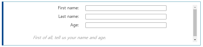 |
- 표 안에 넣은 것 같이 정렬됨
table-caption의 경우caption-side: bottom;을 이용해서 위치 조정 가능
Multi-column layout
Multi-column은 column-count, column-width 등의 properties로 구현 가능
column-count: 열 개수를 지정column-width: 열 너비를 지정해서 viewport에서 가능한한 많은 열 배치
Example
CSS:
1
2
3
.container {
  column-width: 200px;
}
HTML:
1
2
3
4
5
6
<div class="container">
  <h1>Multi-column layout</h1>

  <p>Paragraph 1.</p>
  <p>Paragraph 2.</p>
</div>
| Result: |
|---|
 |
Normal Flow
CSS를 적용하지 않았을 때 normal flow가 default로 적용됨
How are elements laid out by default?
box model : element의 content를 먼저 배치하고, padding, border, margin을 붙임
block level element의 경우
content가 parent element의 inline space를 모두 채우고, content를 수용하기 위해 block dimension 방향(block flow direction)으로 확장함
- block flow direction은 parent의 writing mode에 의해 결정됨(initial: horizontal-tb)
=> 기본적으로 vertically laid out됨
inline element의 경우
content의 size만큼 공간을 차지함
- inline element는 width, height를 설정할 수 없음
=> 수정하기 위해선display: block;ordisplay: inline-block;을 사용해야 함 - 기본적으로 같은 줄에 laid out, overflowing text or elements는 new line으로 내려감
Margin collapsing
adjacent elements가 둘 다 margin이 있고, 두 margin이 만난다면, 큰 것 하나만 적용되고 나머지는 사라짐
line-height는 글자가 가운데 배치되기 때문에 margin collapsing이랑 상관없음
Flexbox
Why Flexbox?
예전에는 float, position과 같은게 reliable cross browser-compatible tool이었음
아래와 같은 간단한 layout도 간단하게 할 수 없었음
- Vertically centering a block of content inside its parent
- Making all the children of a container take up an equal amount of the available width/height, regardless of how much width/height is availble
- Making all columns in a multiple-column layout adopt the same height even if they contain a different amount of content
Flexbox로는 이걸 쉽게 할 수 있다
Introducing a simple example
Flexbox를 소개하기 위해 아래 예제를 사용할 예정(flexbox0.html, style.css)
HTML:
1
2
3
4
5
6
7
8
9
10
11
12
13
14
15
16
17
18
19
20
21
22
23
24
25
26
27
28
29
30
31
32
33
34
35
<!DOCTYPE html>
<html>
<head>
<meta charset="utf-8">
<title>Flexbox 0 — starting code</title>
<link href="style.css" rel="stylesheet" type="text/css">
</head>
<body>
<header>
<h1>Sample flexbox example</h1>
</header>
<section>
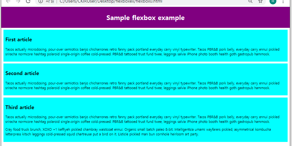
<article>
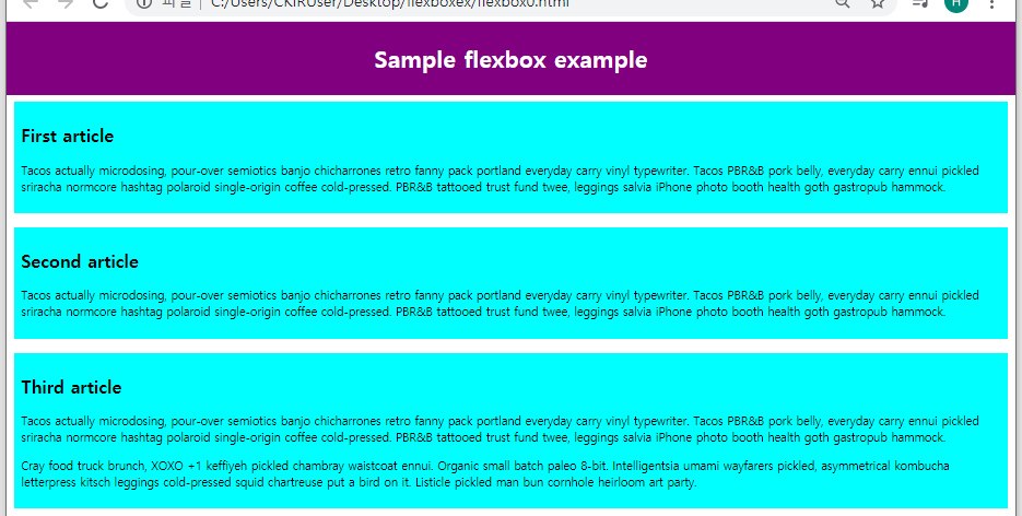
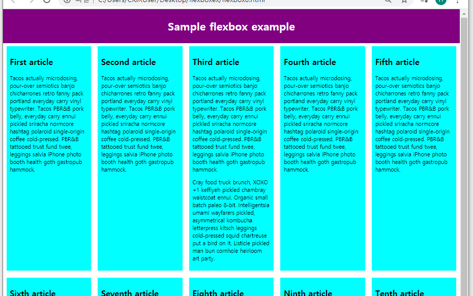
<h2>First article</h2>
<p>Tacos actually microdosing, pour-over semiotics banjo chicharrones retro fanny pack portland everyday carry vinyl typewriter. Tacos PBR&B pork belly, everyday carry ennui pickled sriracha normcore hashtag polaroid single-origin coffee cold-pressed. PBR&B tattooed trust fund twee, leggings salvia iPhone photo booth health goth gastropub hammock.</p>
</article>
<article>
<h2>Second article</h2>
<p>Tacos actually microdosing, pour-over semiotics banjo chicharrones retro fanny pack portland everyday carry vinyl typewriter. Tacos PBR&B pork belly, everyday carry ennui pickled sriracha normcore hashtag polaroid single-origin coffee cold-pressed. PBR&B tattooed trust fund twee, leggings salvia iPhone photo booth health goth gastropub hammock.</p>
</article>
<article>
<h2>Third article</h2>
<p>Tacos actually microdosing, pour-over semiotics banjo chicharrones retro fanny pack portland everyday carry vinyl typewriter. Tacos PBR&B pork belly, everyday carry ennui pickled sriracha normcore hashtag polaroid single-origin coffee cold-pressed. PBR&B tattooed trust fund twee, leggings salvia iPhone photo booth health goth gastropub hammock.</p>
<p>Cray food truck brunch, XOXO +1 keffiyeh pickled chambray waistcoat ennui. Organic small batch paleo 8-bit. Intelligentsia umami wayfarers pickled, asymmetrical kombucha letterpress kitsch leggings cold-pressed squid chartreuse put a bird on it. Listicle pickled man bun cornhole heirloom art party.</p>
</article>
</section>
</body>
</html>
CSS:
1
2
3
4
5
6
7
8
9
10
11
12
13
14
15
16
17
18
19
20
21
22
23
24
25
26
27
html {
  font-family: sans-serif;
}

body {
  margin: 0;
}

header {
  background: purple;
  height: 100px;
}

h1 {
  text-align: center;
  color: white;
  line-height: 100px;
  margin: 0;
}

article {
  padding: 10px;
  margin: 10px;
  background: aqua;
}

/* Add your flexbox CSS below here */
| Result: |
|---|
|
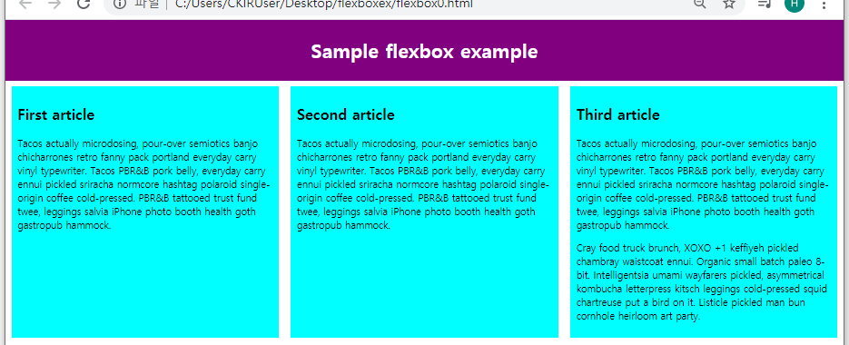
Specifying what elements to lay out as flexible boxes
flex container로 만들 element에 display: flex;를 적용시켜서 flex container를 구현
=> 자동으로 child elements가 flex items가 됨
Example
style.css에 아래 rule을 추가하고 유지:
1
2
3
section {
  display: flex;
}
| Result: |
|---|
|
- 위 예시의 경우
<section>이 flex container,<article>이 flex item - default values에 의해 모든 열들이 같은 열 너비, 높이를 가짐
- flex container는 block-level element와 같이 취급됨
display: inline-flex;를 사용하면 flex items를 inline element같이 취급되게 할 수 있음
The flex model
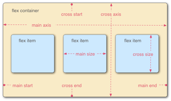
- Main axis : the axis running in the direction the flex items are being laid out.
- Cross axis : the axis running perpendicular to the direction the flex items are being laid out.
- Flex container : the parent element that has
display: flex; - Flex items : the items being laid out as flexible boxes inside the flex container
- flex item은 main axis, cross axis를 기준으로 main size, cross size를 가짐
Columns or rows?
flex-direction property를 이용해서 main axis의 위상을 설정할 수 있음
possible value : row, column, row-reverse, column-reverse (default : row)
main axis가 명시된 후 flex item들이 나열되는 방향은 browser’s default language의 방향에 따름(rl or lr)
Example
style.css의 section rule에 아래 declaration을 임시로 추가하면:
1
flex-direction: column;
| Result: |
|---|
 |
Wrapping
flex item의 width or height를 고정하면 item이 많을 때 flex container를 overflow함(flex item을 임시로 추가함)
<h1>은 vw의 100%를 차지하는 듯- flex item들이 overflow해서 flex container의 영역 밖으로 배치됨
- CSS에 flex item의 width를 고정하는 rule을 넣지 않았지만 최소 width같은게 있는 듯
style.css의 section rule에 아래 declaration을 임시로 추가하면:
1
flex-wrap: wrap;
style.css의 article rule에 아래 declaration을 임시로 추가하면:
1
flex: 200px;
| Result: |
|---|
 |
flex-wrap: warp;을 flex container에 적용하면 overflow되는 item들을 다음 줄로 내림flex: 200px;를 flex item에 적용하면 flex item의 최소 main size를200px로 제한함- flex container의
flex-direction이row-reverse일 경우에 여러 줄의 flex item이 있으면 아예 역순으로 나열되는 것이 아니라, 원래 순서대로 나열한 다음에 줄별로 역순으로 바꿈
default language의 방향에 따라 reverse가 적용된다는 것을 생각하면됨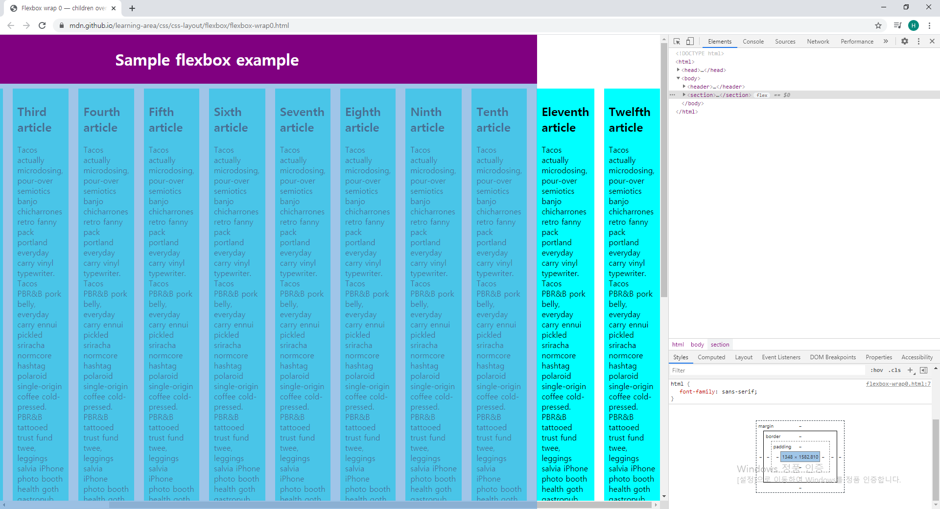
flex-flow shorthand
flex-direction, flex-wrap properties를 flex-flow shorthand property로 줄여쓸 수 있음
Example
1
2
flex-direction: row;
flex-wrap: wrap;
is equal to
1
flex-flow: row wrap;
Flexible sizing of flex items
style.css에 아래 rule을 임시로 추가:
1
2
3
4
5
6
7
article {
  flex: 1 200px;
}

article:nth-of-type(3) {
  flex: 2 200px;
}
| Result: |
|---|
 |
flex: 1 200px;에서- 첫 번째 값
1은 proportion unit으로, 각 list item의 main size의 비율을 정함 - 두 번째 값
200px는 위에서와 같은 최소 main size임
- 첫 번째 값
- 최소 main size가 정의되어 있으면 각각의 flex item에 그만큼씩 준 다음, proportion unit에 따라서 남은 공간을 분배한다고 생각하면 됨
- flex item도 기본적으로 content box일 듯
- browser window를 조절해도 layout이 유지됨 => flexibility, responsiveness ↑
flex: shorthand versus longhand
flex property의 longhand properties 3개:
flex-grow: main size의 비율을 정하는 unitless proportion value(위flex: 1 200px;의1)flex-shrink: overflow가 일어날 때 각 list item들이 줄어드는 비율을 정하는 unitless proportion value(클 수록 더 많이 줄어듬)flex-basis: 최소 main size(위flex: 1 200px;의200px)
웬만하면 longhand는 사용하지 않는게 좋음(shorthand가 더 가독성이 좋음)
Horizontal and vertical alignment
아래 예제를 사용할 예정(flex-align0.html, style.css)
HTML:
1
2
3
4
5
6
7
8
9
10
11
12
13
14
15
16
17
<!DOCTYPE html>
<html>
  <head>
    <meta charset="utf-8">
    <title>Flexbox align 0 — starting code</title>
    <link href="style.css" rel="stylesheet" type="text/css">
  </head>
  <body>
    <div>
      <button>Smile</button>
      <button>Laugh</button>
      <button>Wink</button>
      <button>Shrug</button>
      <button>Blush</button>
    </div>
  </body>
</html>
CSS:
1
2
3
4
5
6
7
8
9
10
11
12
13
14
15
16
17
18
19
20
21
22
html {
  font-family: sans-serif;
}

body {
  width: 70%;
  max-width: 960px;
  margin: 20px auto;
}

button {
  font-size: 18px;
  line-height: 1.5;
  width: 15%;
}

div {
  height: 100px;
  border: 1px solid black;
}

/* Add your flexbox CSS below here */
| Result: |
|---|
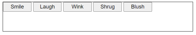 |
style.css에 아래 rule을 추가:
1
2
3
4
5
6
7
8
9
div {
  display: flex;
  align-items: center;
  justify-content: space-around;
}

button:first-child { /* 이 rule은 예시를 본 후 지움 */
  align-self: flex-end;
}
| Result: |
|---|
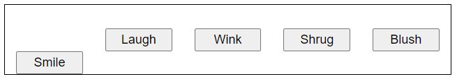 |
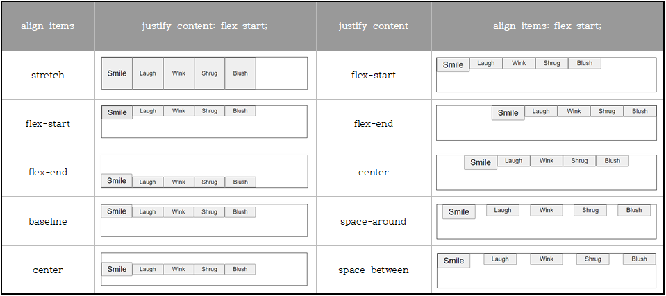
<button>의width가15%로 설정되어있기 때문에 공간을 다 차지하지 않음30%로 설정하면 overflow하지 않고 공간을 다 채우기만 함width를 설정하지 않으면 공간을 다 차지함
align-itemsproperty : cross axis를 기준으로 flex item을 제어함
Possible values:stretch: default 값
cross start쪽으로 flex items를 붙이고 cross axis 방향으로 flex item을 scale
만약 parent가 fixed length를 가지지 않으면 flex items 중 가장 긴(cross axis 기준) 값에 맞춤center: flex item의 intrinsic dimension을 유지하지만 cross axis 기준 가운데로 정렬시킴flex-start,flex-end: 각각 cross start, end쪽으로 flex items를 붙임baseline: cross start로 붙이고 flex items의 content(text)의 밑을 일정하게 맞춤
align-items는align-selfproperty로 override 가능(개별의 flex item에 적용시킬 때 사용)justify-contentproperty : main axis를 기준으로 flex item을 제어함
Values available:flex-start: default 값
main start로 붙임flex-end: main end로 붙임center: main axis 기준 가운데로 정렬(flex item의 intrinsic dimension 유지)space-around: main axis를 따라서 container안에서 flex items가 균동하게 분포됨(첫 번째와 마지막 item이 container와 붙은 쪽의 여백은 flex items 사이의 여백의 반으로 처리됨)space-between: main axis를 따라서 container안에서 flex items가 균동하게 분포됨(첫 번째와 마지막 item이 container와 붙은 쪽의 여백은 없어짐 = 첫 번째와 마지막 item은 container와 딱 붙어있음)
- 즉,
align-items,justify-contentproperties는 flex container의 flow direction을 알아야 사용 가능
Ordering flex items
Source order(HTML에서 순서)를 건드리지 않고 flex items의 layout order를 바꾸는 것도 가능함
flex item에 order property를 적용해서 순서를 정함
accessibility가 떨어질 수 있음
Example
style.css에 아래 rule을 추가:
1
2
3
button:first-child {
  order: 1;
}
| Result: |
|---|
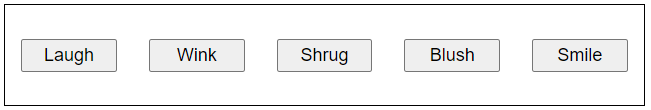 |
order의 default value :0- 값이 클수록 우선순위가 떨어짐
- 값이 같다면 source order를 따름
- 값에
-1를 넣을 수도 있음(=> default인0보다 작으므로 가장 먼저 나타남) order를 사용하면nth-child,nth-of-type등의 properties에도 영향을 줌!!!
Nested flex boxes
Flex boxes를 nesting하는 것도 가능함
이때까지 나온 예제들을 다 합해보면
HTML:
1
2
3
4
5
6
7
8
9
10
11
12
13
14
15
16
17
18
19
20
21
22
23
24
25
26
27
28
29
30
31
32
33
34
35
36
37
38
39
40
41
42
43
<!DOCTYPE html>
<html>
  <head>
    <meta charset="utf-8">
    <title>Complex flexbox example</title>
    <link href="style.css" rel="stylesheet" type="text/css">
  </head>
  <body>
    <header>
      <h1>Complex flexbox example</h1>
    </header>

    <section>
      <article>
        <h2>First article</h2>

        <p>Tacos actually microdosing, pour-over semiotics banjo chicharrones retro fanny pack portland everyday carry vinyl typewriter. Tacos PBR&B pork belly, everyday carry ennui pickled sriracha normcore hashtag polaroid single-origin coffee cold-pressed. PBR&B tattooed trust fund twee, leggings salvia iPhone photo booth health goth gastropub hammock.</p>
      </article>

      <article>
        <h2>Second article</h2>

        <p>Tacos actually microdosing, pour-over semiotics banjo chicharrones retro fanny pack portland everyday carry vinyl typewriter. Tacos PBR&B pork belly, everyday carry ennui pickled sriracha normcore hashtag polaroid single-origin coffee cold-pressed. PBR&B tattooed trust fund twee, leggings salvia iPhone photo booth health goth gastropub hammock.</p>
      </article>

      <article>
        <div>
          <button>Smile</button>
          <button>Laugh</button>
          <button>Wink</button>
          <button>Shrug</button>
          <button>Blush</button>
        </div>
        <div>
          <p>Tacos actually microdosing, pour-over semiotics banjo chicharrones retro fanny pack portland everyday carry vinyl typewriter. Tacos PBR&B pork belly, everyday carry ennui pickled sriracha normcore hashtag polaroid single-origin coffee cold-pressed. PBR&B tattooed trust fund twee, leggings salvia iPhone photo booth health goth gastropub hammock.</p>
        </div>
        <div>
          <p>Cray food truck brunch, XOXO +1 keffiyeh pickled chambray waistcoat ennui. Organic small batch paleo 8-bit. Intelligentsia umami wayfarers pickled, asymmetrical kombucha letterpress kitsch leggings cold-pressed squid chartreuse put a bird on it. Listicle pickled man bun cornhole heirloom art party.</p>
        </div>
      </article>
    </section>
  </body>
</html>
CSS:
1
2
3
4
5
6
7
8
9
10
11
12
13
14
15
16
17
18
19
20
21
22
23
24
25
26
27
28
29
30
31
32
33
34
35
36
37
38
39
40
41
42
43
44
45
46
47
48
49
50
51
52
53
54
55
56
html {
  font-family: sans-serif;
}

body {
  margin: 0;
}

header {
  background: purple;
  height: 100px;
}

h1 {
  text-align: center;
  color: white;
  line-height: 100px;
  margin: 0;
}

article {
  padding: 10px;
  margin: 10px;
  background: aqua;
}

/* Add your flexbox CSS below here */

section {
  display: flex;
}

article {
  flex: 1 200px;
}

article:nth-of-type(3) {
  flex: 3 200px;
  display: flex;
  flex-flow: column;
}

article:nth-of-type(3) div:first-child {
  flex: 1 100px;
  display: flex;
  flex-flow: row wrap;
  align-items: center;
  justify-content: space-around;
}

button {
  flex: 1 auto;
  margin: 5px;
  font-size: 18px;
  line-height: 1.5;
}
| Result: |
|---|
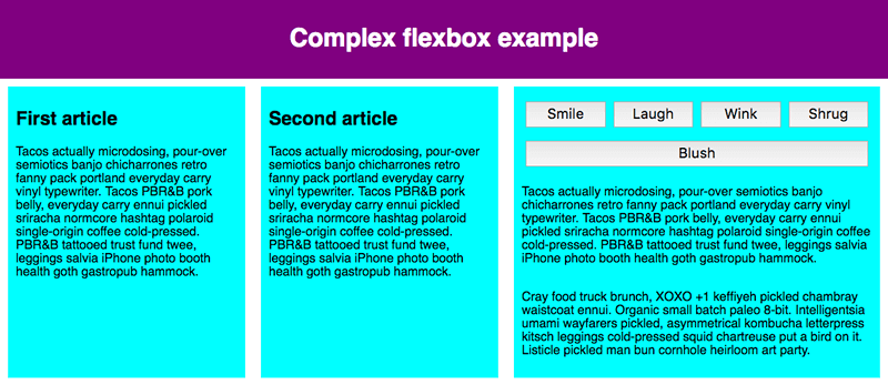 |
- flexbox로 지정되는 element는 모두 block element이기 때문에 HTML에서 table, list를 nest하는 것과 비슷함
- flex container 관련 properties:
displayflex-flow(flex-directionflex-wrap)align-items: cross axis 기준justify-content: main axis 기준align-content(여러 줄로 펼쳐졌을 때)
- flex item 관련 properties:
flex(flex-growflex-shrinkflex-basis)align-selforderz-index: grid에서의 설명 참고
Cross-browser compatibility
IE는 IE11+에서만 flex를 지원함!
flex같은 layout method는 지원되지 않으면 웹사이트를 아예 unusable하게 만들어버리기 때문에 주의
Grids
What is grid layout?
Grid : two-dimensional layout system for the web
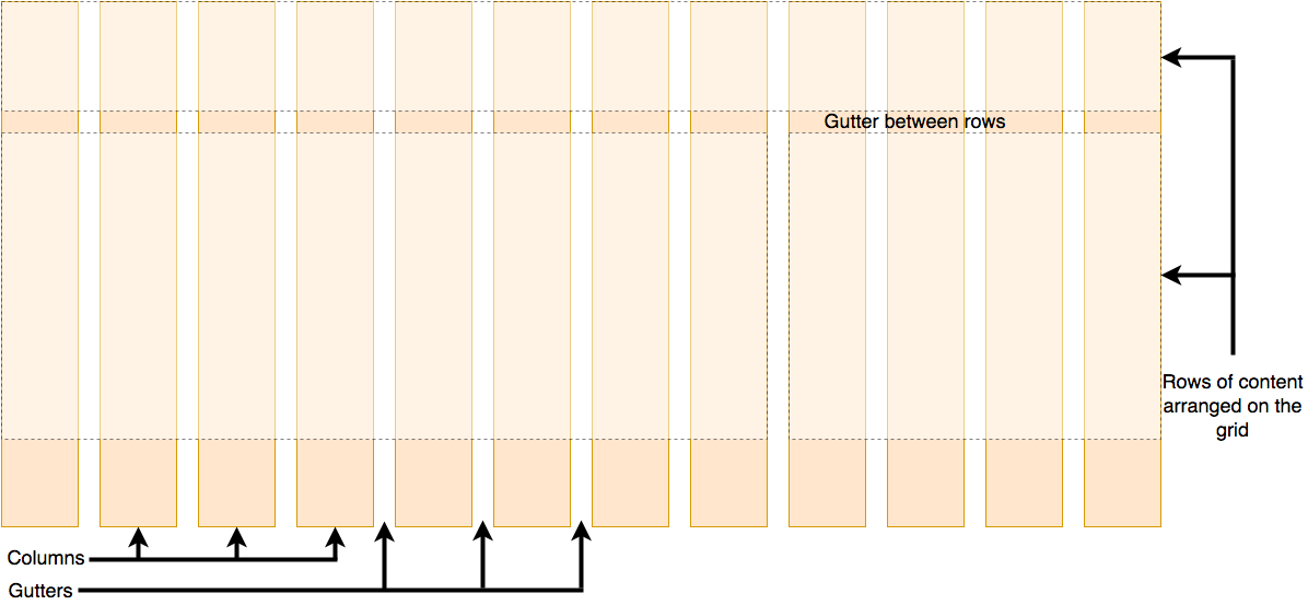
- column, row, gutter로 이루어짐
Creating your grid in CSS
grid-area로 element별 alias를 만들어두면grid-template-areas를 이용해서 그걸로 바로 layout을 짤 수 있음grid-gap으로 gutter 설정 가능grid-template-rows,grid-template-columns로 row, column 별로 sizing 가능
Defining a grid
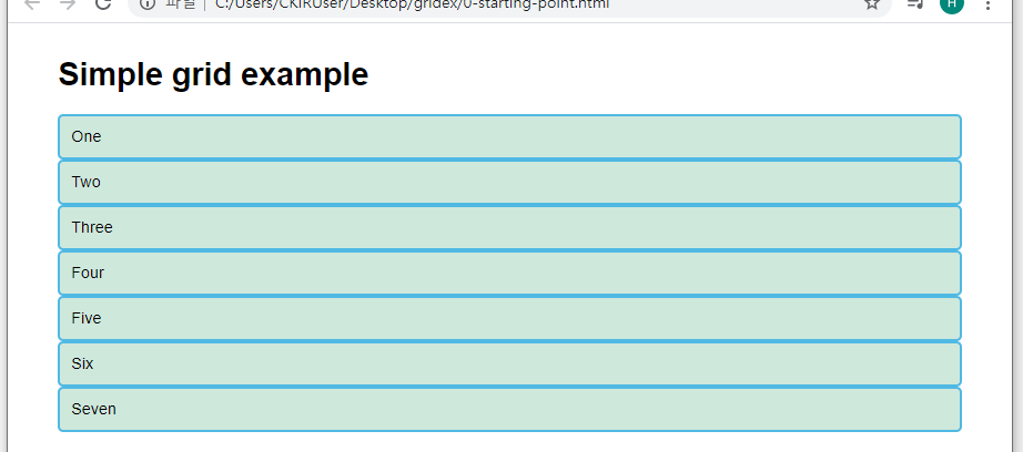
아래 예제를 사용(0-stargint-point.html, style.css)
HTML:
1
2
3
4
5
6
7
8
9
10
11
12
13
14
15
16
17
18
19
20
21
22
23
24
25
<!DOCTYPE html>
<html>

<head>
    <meta charset="utf-8">
    <title>CSS Grid starting point</title>
    <link href="style.css" rel="stylesheet" type="text/css">
</head>

<body>
    <h1>Simple grid example</h1>

    <div class="container">
        <div>One</div>
        <div>Two</div>
        <div>Three</div>
        <div>Four</div>
        <div>Five</div>
        <div>Six</div>
        <div>Seven</div>
    </div>

</body>

</html>
CSS:
1
2
3
4
5
6
7
8
9
10
11
12
13
body {
  width: 90%;
  max-width: 900px;
  margin: 2em auto;
  font: .9em/1.2 Arial, Helvetica, sans-serif;
}

.container > div {
  border-radius: 5px;
  padding: 10px;
  background-color: rgb(207,232,220);
  border: 2px solid rgb(79,185,227);
}
| Result: |
|---|
 |
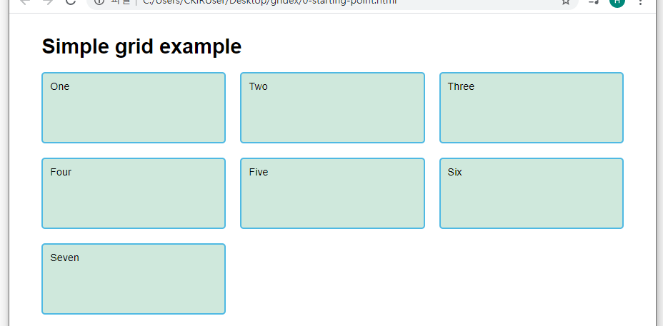
style.css에 아래 rule을 추가:
1
2
3
4
.container {
  display: grid;
  grid-template-columns: 200px 200px 200px;
}
| Result: |
|---|
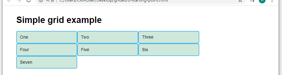 |
display: grid;를 적용해서 grid layout 사용- single column grid가 default로 적용됨
grid-template-columnsproperty를 사용해서 columns와 너비를 정의
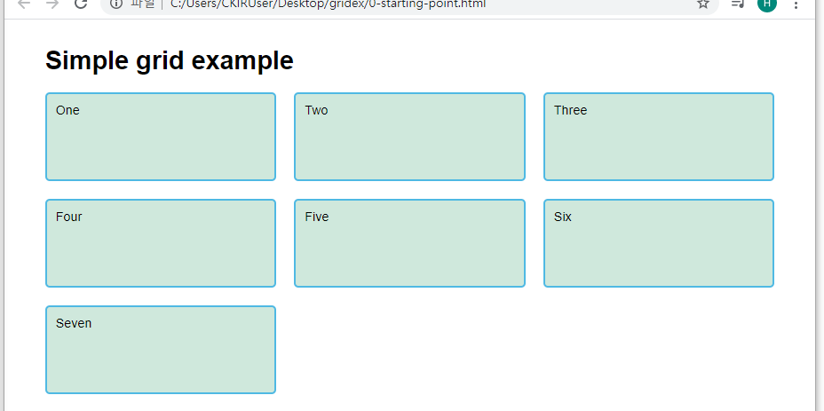
Flexible grids with the fr unit
Use fr unit to flexibly size grid rows and columns
fr represents one fraction of the available space in the grid container
=> flex-grow의 proportional value와 비슷하게, grid container의 남은 공간을 fr끼리 나눠가짐
Example
style.css의 .container rule을 변경:
1
2
3
4
.container {
  display: grid;
  grid-template-columns: 2fr 1fr 1fr;
}
| Result: |
|---|
 |
grid-template-rows(-columns)에fr과 fixed length를 섞어서 사용할 수 있음- fixed length에 공간을 분배한 다음 남은 공간을
fr들이 가져감 - grid items 중 하나가 공간을 많이 차지할 경우
fr이 나눠가질 공간이 없어짐
- fixed length에 공간을 분배한 다음 남은 공간을
Gaps between tracks
column-gap, row-gap, gap properties를 사용해서 gutter 설정 가능
Example
style.css의 .container rule을 변경:
1
2
3
4
5
.container {
  display: grid;
  grid-template-columns: 2fr 1fr 1fr;
  gap: 20px;
}
| Result: |
|---|
|
gap에는frunit 사용 불가
*gap*properties는grid-prefix가 붙어 있었지만 수정됨(다른 layout methods에서도 gap을 사용하기 위해)
하지만 prefixed version이 유지되기 때문에 bulletproof하게 만들려면 둘 다 추가하면 됨(grid-gap,gap)
Repeating track listings
repeat function을 이용해서 반복되는 설정을 선언 가능
두 번째 parameter는 track listing으로, 여러 값이 들어갈 수 있음
e.g. repeat(3, 1fr 2fr) is equal to 1fr 2fr 1fr 2fr 1fr 2fr
The implicit and explicit grid
- Explicit grid :
grid-template-columns,grid-template-rows를 이용해서 생성된 grid - Implicit grid : explicit grid로 선언되지 않았을 때 자동으로 생성됨
auto로 sizing됨 : content를 채울 만큼 커짐grid-auto-rows,grid-auto-columns를 사용해서 implicit grid에 size를 선언 가능
implicit grid는 몇 개로 선언될 지 모르기 때문에 size를 한 번에 정의해야 함
Example
style.css의 .container rule을 변경:
1
2
3
4
5
6
.container {
  display: grid;
  grid-template-columns: repeat(3, 1fr);
  grid-auto-rows: 100px;
  gap: 20px;
}
| Result: |
|---|
 |
- explicit grid, implicit grid을 둘 다 사용할 수 있음
Example
1
2
3
4
.container {
  grid-template-columns: 50px;
  grid-auto-columns: 1fr 2fr;
}
위와 같이 선언하면 column line number 1만 50px로 고정되고 나머지 column들은 1fr 2fr의 패턴으로 반복됨
이 때 implicit columns를 만드는 item 다음 item부터 영역을 지정해놓지 않으면, 자동으로 grid에 순서대로 들어감(grid-auto-flow에 따라서 배치됨)
grid-auto-flow
items가 배치되는 방법을 정의함
possible values:
row: item의 순서대로 row를 하나씩 채워나감(item을 넣을 수 없으면 다음 row로 이동)column: item의 순서대로 column을 하나씩 채워나감(item을 넣을 수 없으면 다음 column로 이동)dense: item의 순서 상관없이 빈틈이 없게 채움row dense: item의 순서 상관없이 빈틈이 없게 채우는데 row가 우선적으로 채워짐column dense: item의 순서 상관없이 빈틈이 없게 채우는데 column이 우선적으로 채워짐
The minmax() function
minmax() function을 이용해서 min, max size 지정 가능
auto를 이용하면 max가 content에 맞춰지게 설정 가능
e.g. grid-auto-rows: minmax(100px, auto);
 |
|
※ row/column이 늘어나는 것은 다른 item에도 영향을 줌
As many columns as will fit
가능한 많은 열을 만들고 싶을 때
grid-template-columns: repeat(auto-fill, minmax(200px, 1fr));
와 같이 사용 가능
Example
style.css의 .container rule을 변경:
1
2
3
4
5
6
.container {
  display: grid;
  grid-template-columns: repeat(auto-fill, minmax(200px, 1fr));
  grid-auto-rows: minmax(100px, auto);
  gap: 20px;
}
| Result: |
|---|
 |
 |
- flex에서 flex items의 width를 지정하지 않았을 때 늘어나는 것과 비슷
- column은 너비가 200px인 col을 최대로 만든 다음, 남는 공간은 균등하게 분배
- row는 최소 100px, 각 row별로 필요한 만큼 늘어남
auto-fill: items의 총 너비가 container의 너비보다 작을 경우 공간을 남김auto-fit: items의 총 너비가 container의 너비보다 작을 경우 공간을 채움(items가 늘어남)
Line-based placement
grid의 line은 1에서 시작하고, writing mode에 의해서 방향이 결정됨
영어는 lr => 1 … n, 아랍어는 rl => n … 1
grid-column-start, grid-column-end, grid-row-start, grid-row-end properties를 이용해서 item을 원하는 영역에 배치 가능
grid-column, grid-row shorthand properties 사용 가능
(/를 이용해서 구분)
Example
CSS:
1
2
3
4
5
6
7
8
9
10
11
12
13
14
15
16
17
18
19
header {
  grid-column: 1 / 3;
  grid-row: 1;
}

article {
  grid-column: 2;
  grid-row: 2;
}

aside {
  grid-column: 1;
  grid-row: 2;
}

footer {
  grid-column: 1 / 3;
  grid-row: 3;
}
| Result: |
|---|
 |
-1과 같이 음수도 사용 가능(끝에서부터 count됨)grid-row: 1;과 같이 row를 선언할 수도 있음
=> 하나의 row만 차지한다는 뜻임(⇔grid-row: 1 / 2;)span을 이용할 수도 있음
e.g.1 / span 2is equal to1 / 3
Positioning with grid-template-areas
grid-template-areas property를 이용해서 items를 배치할 수 있음
Example
CSS:
1
2
3
4
5
6
7
8
9
10
11
12
13
14
15
16
17
18
19
20
21
22
23
24
25
.container {
  display: grid;
  grid-template-areas:
      "header header"
      "sidebar content"
      "footer footer";
  grid-template-columns: 1fr 3fr;
  gap: 20px;
}

header {
  grid-area: header;
}

article {
  grid-area: content;
}

aside {
  grid-area: sidebar;
}

footer {
  grid-area: footer;
}
| Result: |
|---|
| Line-based placement와 같음 |
- line number를 사용하지 않고 배치 가능
grid-area로 각 item들의 alias를 줘야 함grid-template-areas로 item들을 배치- grid의 모든 cell이 채워져야 함
- span을 하기 위해선 span할 영역을 모두 채움
- cell을 빈칸으로 남기기 위해선
.사용
- 영역들은 모두 직사각형임, L-shaped area 불가능
- areas는 다른 위치에 반복될 수 없음(떨어진 두 영역을 차지할 수 없음)
A CSS Grid, grid framework
Grid frameworks는 12-16 column grids임
Example
CSS:
1
2
3
4
5
6
7
8
9
10
11
12
13
14
15
16
17
18
19
20
21
22
23
24
25
.container {
  display: grid;
  grid-template-columns: repeat(12, minmax(0,1fr));
  grid-gap: 20px;
}

header {
  grid-column: 1 / 13;
  grid-row: 1;
}

article {
  grid-column: 4 / 13;
  grid-row: 2;
}

aside {
  grid-column: 1 / 4;
  grid-row: 2;
}

footer {
  grid-column: 1 / 13;
  grid-row: 3;
}
| Result: |
|---|
 |
- line-based placement를 지정하지 않으면 각각의 item들은 column 하나씩을 차지함(row는 implicit grid이기 때문에 자동으로 한 줄만 생성됨)
grid-template-*의fr으로 비율을 설정할 수도 있지만 위와 같이 frameworks를 이용해서 비율을 설정할 수도 있음
Grid 정렬
Flex에서와 비슷함
align-items
grid cells 내에서 item을 column 방향으로 정렬
container에 적용
possible values:
stretchstart,endcenter
justify-items
grid cells 내에서 item을 row 방향으로 정렬
container에 적용
possible values:
stretchstart,endcenter
align-content
grid container 내에서 items를 column 방향으로 정렬
container에 적용
possible values:
stretchstart,endcenterspace-between,space-around,space-evenly
justify-content
grid container 내에서 items를 row 방향으로 정렬
container에 적용
possible values:
stretchstart,endcenterspace-between,space-around,space-evenly
align-self
item을 column 방향으로 정렬
item에 적용
possible values:
stretchstart,endcenter
justify-self
item을 row 방향으로 정렬
item에 적용
possible values:
stretchstart,endcenter
shorthands
place-items:align-itemsjustify-items순서로 작성place-content:align-contentjustify-content순서로 작성place-self:align-selfjustify-self순서로 작성
※ 각 property의 예시는 여기 참고
flex와 다르게 justify-items가 추가됨(2차원이기 때문에)
Grid order
flex와 마찬가지로 order property를 이용해서 우선순위 정의
z-index
z-index property를 이용해서 z축으로 정렬할 수도 있음
value가 클수록 item이 위로 올라옴
grid item에 적용
default value : 0
Properties
Grid container 관련 properties:
displaygap(row-gapcolumn-gap)grid-template-areas: alias로 영역 지정grid-template-rowsgrid-template-columnsgrid-auto-rowsgrid-auto-columnsgrid-auto-flow: implicit grid에 대해 item이 채워지는 방식 정의place-items(align-itemsjustify-items)align-items(grid cell 내에서 vertical 정렬)justify-items(grid cell 내에서 horizontal 정렬)
place-content(align-contentjustify-content)align-content(items 전체의 vertical 정렬)justify-content(items 전체의 horizontal 정렬)
Grid item 관련 properties:
grid-area: item의 alias 지정grid-columngrid-rowalign-self: item의align-itemsoverridingjustify-self: item의justify-itemsoverridingorder: 나열되는 순서 설정z-index: z축으로 우선순위 설정
Floats
The background of floats
float로 처음에는 image만 띄우다가 다른 요소들도 float할 수 있다는 것을 깨닫고 용도가 다양해짐
나중에는 아예 web site layout을 float로 구성함
최근에는 더 나은 layout techniques가 나왔기 때문에 float를 사용한 layout은 이제 legacy technique로 취급됨
이 article에서는 site layout이 아닌 proper uses를 살펴볼 예정
A simple float example
아래 예제를 이용할 예정:
HTML:
1
2
3
4
5
6
7
8
9
10
11
12
13
14
15
16
17
18
19
<!DOCTYPE html>
<html lang="en-US">
  <head>
    <meta charset="utf-8">
    <title>My test page</title>
    <link href="style.css" rel="stylesheet" type="text/css">
  </head>
  <body>
<h1>Simple float example</h1>

<div class="box">Float</div>

<p>Lorem ipsum dolor sit amet, consectetur adipiscing elit. Nulla luctus aliquam dolor, eu lacinia lorem placerat vulputate. Duis felis orci, pulvinar id metus ut, rutrum luctus orci. Cras porttitor imperdiet nunc, at ultricies tellus laoreet sit amet. </p>

<p>Sed auctor cursus massa at porta. Integer ligula ipsum, tristique sit amet orci vel, viverra egestas ligula. Curabitur vehicula tellus neque, ac ornare ex malesuada et. In vitae convallis lacus. Aliquam erat volutpat. Suspendisse ac imperdiet turpis. Aenean finibus sollicitudin eros pharetra congue. Duis ornare egestas augue ut luctus. Proin blandit quam nec lacus varius commodo et a urna. Ut id ornare felis, eget fermentum sapien.</p>

<p>Nam vulputate diam nec tempor bibendum. Donec luctus augue eget malesuada ultrices. Phasellus turpis est, posuere sit amet dapibus ut, facilisis sed est. Nam id risus quis ante semper consectetur eget aliquam lorem. Vivamus tristique elit dolor, sed pretium metus suscipit vel. Mauris ultricies lectus sed lobortis finibus. Vivamus eu urna eget velit cursus viverra quis vestibulum sem. Aliquam tincidunt eget purus in interdum. Cum sociis natoque penatibus et magnis dis parturient montes, nascetur ridiculus mus.</p>
  </body>
</html>
CSS:
1
2
3
4
5
6
7
8
9
10
11
12
13
14
15
16
body {
  width: 90%;
  max-width: 900px;
  margin: 0 auto;
  font: .9em/1.2 Arial, Helvetica, sans-serif
}

.box {
  float: left;
  margin-right: 15px;
  width: 150px;
  height: 100px;
  border-radius: 5px;
  background-color: rgb(207,232,220);
  padding: 1em;
}
| Result: |
|---|
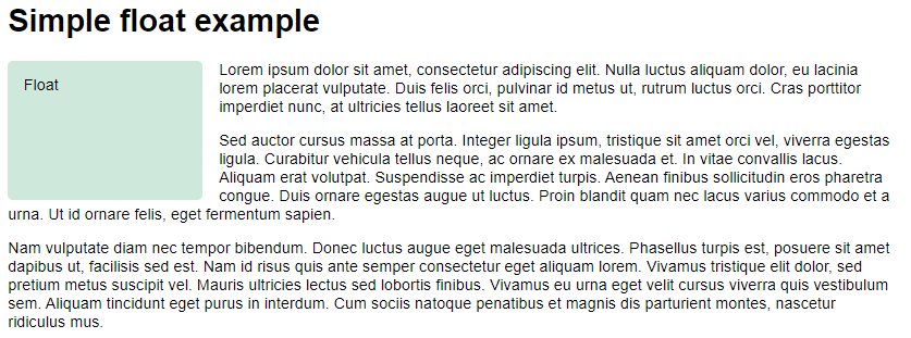 |
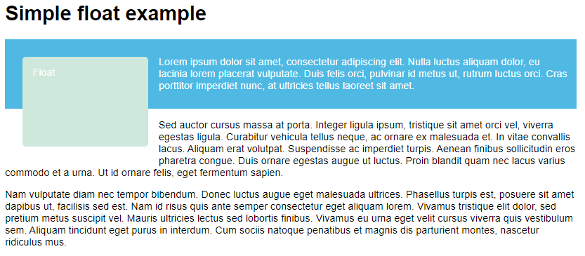
- float가 적용된 element(
.box)는 normal flow에서 제외되고 parent container의 왼쪽에 배치됨 - normal layout flow에서
.box뒤에 오는 element는.box를 감쌈(.box보다 윗쪽은 제외) - floated item과 다른 element 사이에 여백을 추가하려면 floated item의 margin을 조절해야 함
- 위의 예제에서
<p>의 padding을 조절해도 floated와의 여백은 그대로임
∵.box가 normal flow에서 제외되어서<p>들은.box밑에서 layout되기 때문 - 첫 번째
<p>의 영역을 표시해보면 아래와 같음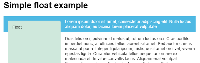
- line box와 관련있음(line box : each line을 감싸는 box, containing block과는 다름)
- 위의 예제에서
display: inline-block;을 적용한 것과 비슷한 효과임
Clearing floats
clear property를 이용해서 following elements가 float를 wrap하는 것을 멈출 수 있음
possible values:
left: 왼쪽에 floated item이 없게 배치됨right: 오른쪽에 floated item이 없게 배치됨both: 양쪽에 floated item이 없게 배치됨
Example
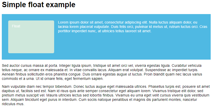
두 번째 <p>에 아래 CSS 추가:
1
2
3
.cleared {
  clear: left;
}
| Result: |
|---|
 |
- clearing이라는 keyword의 의미는 normal flow에서 제외된 상태인 float를 다시 인식시킨다 정도로 생각하면 될 듯
Clearing boxes wrapped around a float
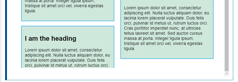
float와 첫 번째 문단을 <div class="wrapper">로 감싸고 .cleared rule 지운 다음 아래 css 추가:
HTML:
1
2
3
4
5
6
7
...
<div class="wrapper">
  <div class="box">Float</div>

  <p>Lorem ipsum dolor sit amet, consectetur adipiscing elit. Nulla luctus aliquam dolor, eu lacinia lorem placerat vulputate.</p>
</div>
...
CSS:
1
2
3
4
5
.wrapper {
  background-color: rgb(79,185,227);
  padding: 10px;
  color: #fff;
}
| Result: |
|---|
 |
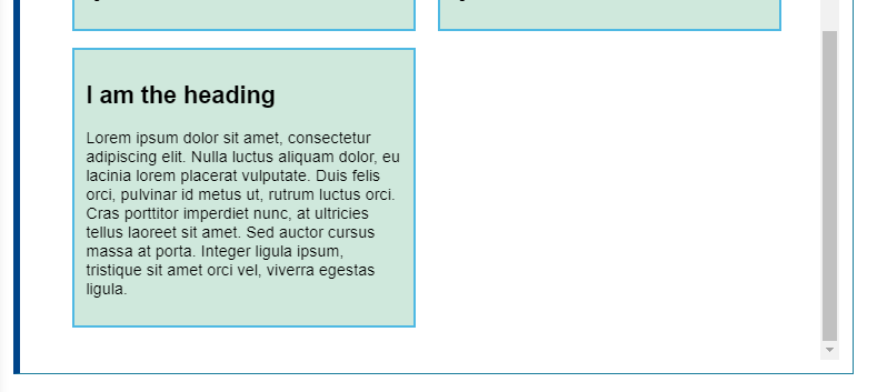
- float가 normal flow에서 제외되었기 때문에 box가 제대로 감싸지 못함
- following element를 clear해도 해결되지 않음
- 3가지 solution이 존재
The clearfix hack
clearfix hack : generated content를 wrapping box뒤에 삽입해서 clear both 추가하는 방법
1
2
3
4
5
.wrapper::after {
  content: "";
  clear: both;
  display: block;
}
| Result: |
|---|
 |
- wrapper 뒤에 element를 삽입하고
clear: both를 추가한 것과 같음
Using overflow
overflow: auto;를 사용해서 해결할 수도 있음(default: visible)
overflow: auto;에 의해 BFC가 생성되어서 clear됨
보통 해결되지만, overflow 사용으로 인해 unwanted scrollbars or clipped shadows가 생길 수 있음
.wrapper을 아래 css로 변경:
1
2
3
4
5
6
.wrapper {
  background-color: rgb(79,185,227);
  padding: 10px;
  color: #fff;
  overflow: auto;
}
결과는 clearfix hack을 사용했을 때와 같음
display: flow-root
modern way of solving this problem
display: flow-root;를 overflow: auto; 대신 사용하면 됨
원리는 BFC를 생성하는 것으로 위 방법들과 동일함
결과는 clearfix hack과 같음
Positioning
Introducing positioning
The whole idea of positioning is to allow us to override the basic document flow behavior, to produce interesting effects.
position property를 사용해서 구현
아래 예제를 사용할 예정:
HTML:
1
2
3
4
5
6
7
8
9
10
11
12
13
14
15
16
17
18
19
20
21
<!DOCTYPE html>
<html>
<head>
<meta charset="utf-8">
<title>Basic document flow</title>
</head>
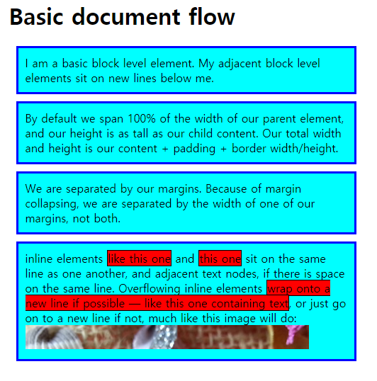
<body>
<h1>Basic document flow</h1>
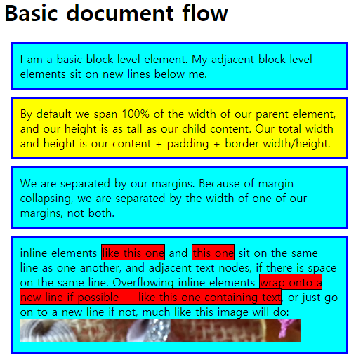
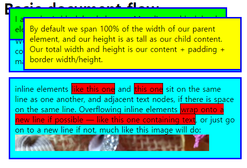
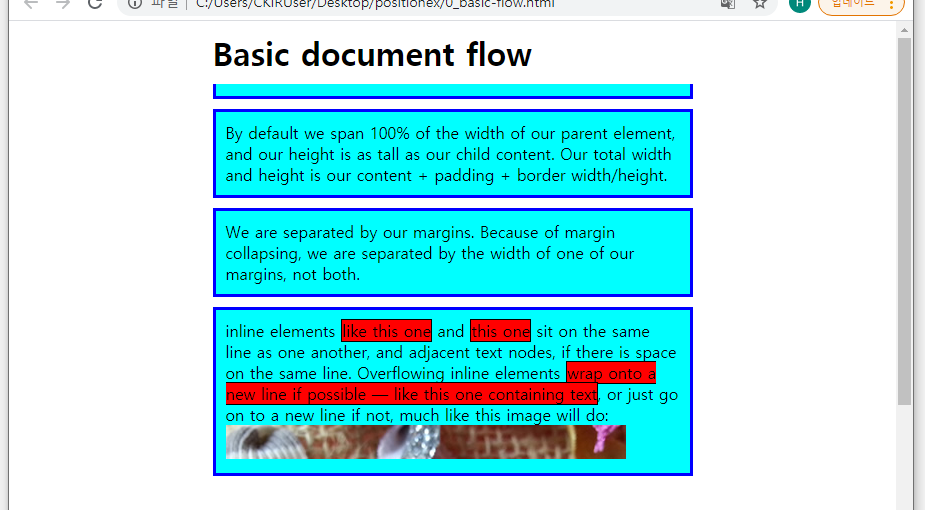
<p>I am a basic block level element. My adjacent block level elements sit on new lines below me.</p>
<p>By default we span 100% of the width of our parent element, and our height is as tall as our child content. Our total width and height is our content + padding + border width/height.</p>
<p>We are separated by our margins. Because of margin collapsing, we are separated by the width of one of our margins, not both.</p>
<p>inline elements <span>like this one</span> and <span>this one</span> sit on the same line as one another, and adjacent text nodes, if there is space on the same line. Overflowing inline elements <span>wrap onto a new line if possible — like this one containing text</span>, or just go on to a new line if not, much like this image will do: <img src="https://github.com/mdn/learning-area/blob/master/css/css-layout/positioning/long.jpg?raw=true"></p>
</body>
</html>
CSS:
1
2
3
4
5
6
7
8
9
10
11
12
13
14
15
16
body {
  width: 500px;
  margin: 0 auto;
}

p {
  background: aqua;
  border: 3px solid blue;
  padding: 10px;
  margin: 10px;
}

span {
  background: red;
  border: 1px solid black;
}
| Result: |
|---|
 |
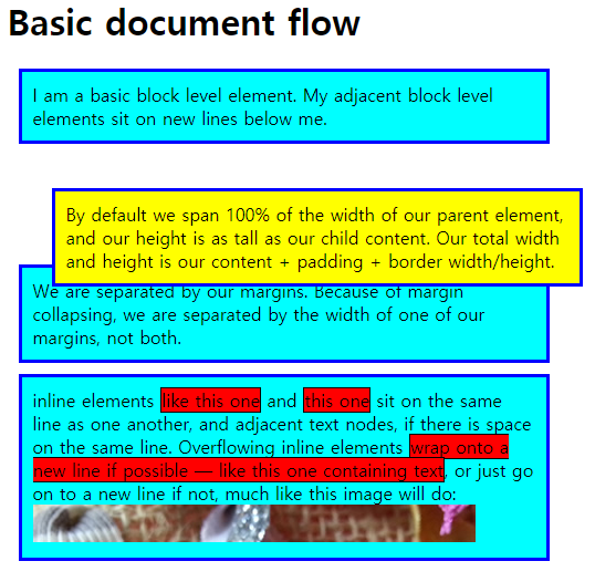
Static positioning
position: static;을 사용해서 구현
position property의 default value
element를 normal flow에서의 위치에 배치
Example
두 번째 p에 positioned class 추가하고 rule 선언:
HTML:
1
<p class="positioned">...</p>
CSS:
1
2
3
4
.positioned {
  position: static;
  background: yellow;
}
| Result: |
|---|
 |
- static positioning이 default behavior이기 때문에 위치는 변화없음
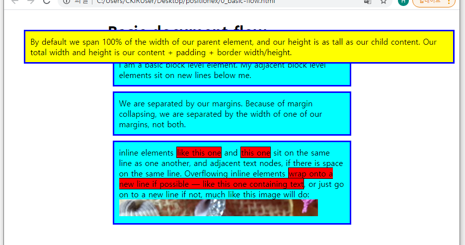
Relative positioning
relative value 이용
element가 normal flow에 의해 배치된 다음 top, bottom, left, right properties 이용해서 final position을 수정 가능
Introducing top, bottom, left, and right
위에 4개의 properties(top, bottom, left, right)는 positioned element를 옮기기 위해 position과 함께 사용됨
Example
.positioned rule을 변경:
1
2
3
4
5
6
.positioned {
  position: relative;
  top: 30px;
  left: 30px;
  background: yellow;
}
| Result: |
|---|
 |
top,bottom,left,right의 value로 pixels, mm, rems, % 등의 unit들이 가능함top: 30px;는 위에 30px만큼 거리를 띄운다고 생각하면 될 듯
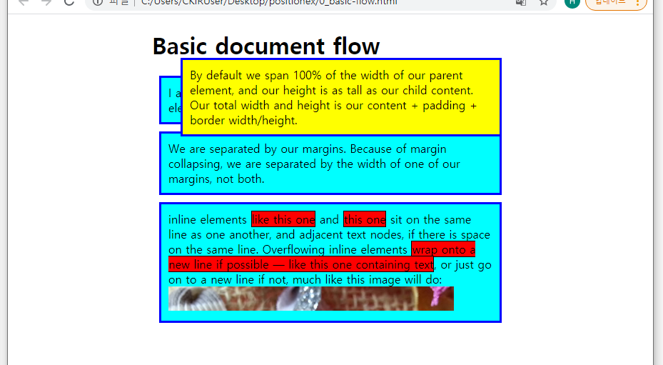
Absolute positioning
absolute positioned element는 normal document layout flow에서 제외되고, 자신만의 layer에 배치되어 다른 elements와 간섭하지 않음
absolute positioning에서는 top, bottom, left, right가 normal flow에서의 relative position 기준이 아니라 containing block을 기준으로 거리를 벌림
Example
.positioned rule을 변경:
1
position: absolute;
| Result: |
|---|
 |
top,bottom,left,right,margin모두0으로 설정하면 화면을 가득 채움
=>margin이 적용됨(margin collapsing은 일어나지 않음)
Positioning contexts
position의 value에 따라서 containing block을 구하는 방법:
position:static,relative,sticky- the content box of the nearest ancestor element that is either a block container or establishes a formatting context
position:absolute- the padding box of the nearest ancestor element that has a
positionvalue other thanstatic(e.g.relative,sticky,fixed,absolute)
- the padding box of the nearest ancestor element that has a
position:fixed- the viewport or the page area
position:fixed,absolute의 경우 다른 기준도 있음
Initial containing block : the containing block in which the root element(<html>) resides
- Initial containing block에 relative할 경우
<html>element 밖에 display됨(relative to initial viewport)
위 예시에서는 absolute positioned element가 <body>안에 nested되어 있지만, final layout에서는 relative to the page area
positioning context : which element the absolutely positioned element is positioned relative to
- absolutely positioned element의 ancestors 중 하나에 positioning을 설정해서 바꿀 수 있음
- element가 nesting하고 있는 elements에만 relative하게 position할 수 있음
<body>에 declaration 추가:
1
`position: relative;`
| Result: |
|---|
 |
<body>에 relative positioning을 적용해서.positioned의 containing block이<body>로 변경됨
Introducing z-index
아래 CSS를 추가:
1
2
3
4
5
6
p:nth-of-type(1) {
  position: absolute;
  background: lime;
  top: 10px;
  right: 30px;
}
| Result: |
|---|
 |
- 더 나중에 position된
.positioned가 더 앞으로 나옴 z-indexproperty를 사용해서 stack 순서를 바꿀 수 있음- 숫자가 높을수록 더 앞에 쌓임
- default value : 0
- unitless index value만 대입 가능
Fixed positioning
Fixed positioning은 absolute와 동일하게 작동하지만, 기준이 다름
- 보통 viewport에 relative함
- ancestor 중에
transformproperty를 이용해서 회전하는 등의 조건을 충족하는 element가 있으면 그 element의 padding box에 relative함
Example
p:nth-of-type(1), .positioned rule 지우고 아래 CSS를 추가:
1
2
3
4
5
6
7
8
9
10
11
12
13
14
body {
  width: 500px;
  height: 1400px;
  margin: 0 auto;
}

h1 {
  position: fixed;
  top: 0;
  width: 500px;
  margin-top: 0;
  background: white;
  padding: 10px;
}
| Result: |
|---|
 |
<h1>이 viewport 위쪽에 고정되지만, 첫 번째<p>가 가려짐- fixed positioning도 element를 normal flow에서 제외시키기 때문
- 첫 번째
<p>에 top margin을 줘서 해결
Sticky positioning
relative와 fixed position을 혼합한 상태임
=> 특정한 threshold(e.g. viewport의 top에서 10px)까지 스크롤 전에는 relatively positioned, 그 다음부터는 fixed
아래 CSS처럼 적용 가능함:
1
2
3
4
5
.positioned {
  position: sticky;
  top: 30px;
  left: 30px;
}
top,left등의 property로 threshold 정함(이 element가 threshold 위치에 도달하면 fixed로 바뀜)<dt>와 같은 element에 적용시켜서 엑셀의 틀고정과 같은 효과를 만들 수 있음
Multiple-column layout
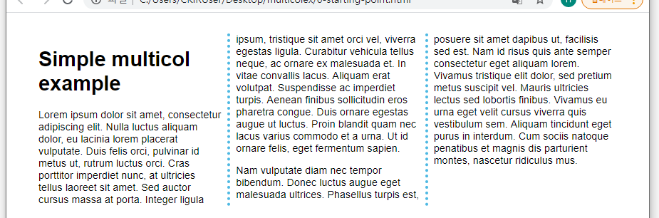
A basic example
열 나누기는 column-count, column-width properties를 사용해서 구현함
column-count- value : unitless
- 지정한 값 만큼 column을 만듦(viewport를 변화시켜도 열 개수 일정)
e.g.column-count: 3;
column-width- value : 길이 관련 unit들
- grid에서
grid-template-columns: repeat(auto-fill, minmax(200px, 1fr));를 사용하는 것과 비슷함
최소 width가 설정한 값이 되고, 나머지가 있으면 column끼리 분배함
e.g.column-width: 200px;
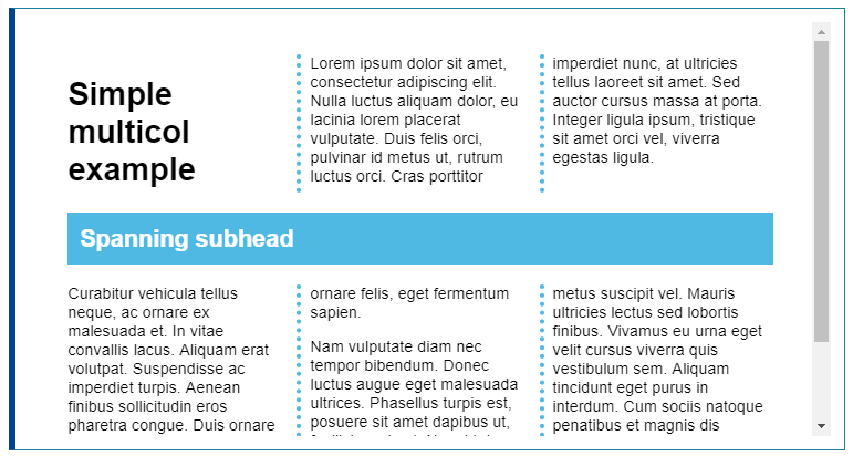
Styling the columns
multicol로 생성된 columns는 개별로 styling할 수 없음
i.e. 한 열만 넓게 하거나 배경을 바꾸는 등의 작업 불가
아래 properties를 사용해서 전체적인 styling 가능
column-gap: 열 사이의 gap 설정20px로 설정하면 열 사이에 간격은20px임(40px가 아님)
column-rule: 열 사이에 구분선 설정column-rule-colorcolumn-rule-stylecolumn-rule-width의 shorthand property임borderproperty와 비슷하게 설정
Example
1
2
3
4
5
.container {
  column-width: 200px;
  column-gap: 20px;
  column-rule: 4px dotted rgb(79, 185, 227);
}
| Result: |
|---|
 |
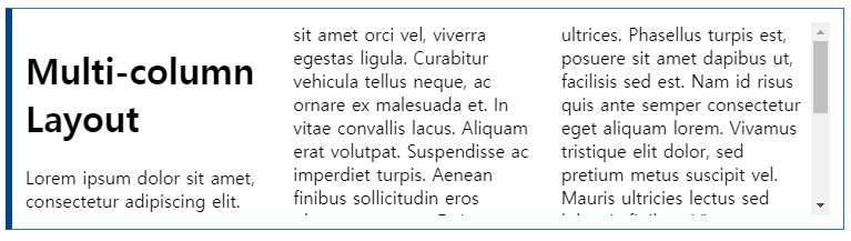
Spanning columns
column-span property를 사용해서 element가 열들을 가로질러 span하게 만들 수 있음
span하는 범위를 설정할 수 없음
values available:
none: default, span하지 않음all: 모든 열을 가로질러 span함
Example
Columns and fragmentation
multicol을 사용하면 content가 쪼개져서 columns에 들어가는데, 그 과정에서 아래와 같이 content의 가독성이 떨어질 수 있음
이런 현상을 break-inside: avoid; declaration을 사용해서 없앨 수 있음
break-inside property를 적용하면 내부 content의 break를 제어함
=> 끊기지 않아야 할 content가 들어있는 container에 적용해야 함
older version인 page-break-inside도 추가해서 browser support를 높일 수 있음
- content가 잘리지 않은 채 layout됨
Test your skills
column-gap은column-rule의 두께까지 고려해서 계산해야 함(rule이5px이고 rule과 column 사이 공간을10px로 설정하고 싶다면 gap을25px로 줘야함::before,::after등의 pseudo-element를 선언하고border-bottomproperty를 이용해서 글자를 둘러싸는 선을 만들 수 있음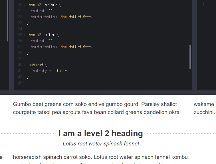
Responsive design
screen의 크기가 다양해지면서 하나의 layout으로는 모든 screen을 지원할 수 없게 됨
스크린의 너비, 해상도 등에 따라 layout을 결정하는 Responsive Web Design(RWD)가 나타남
Historic website layouts
예전에는 website를 설계할 때 두 가지 선택지가 있었음
- liquid site, browser window에 따라서 늘리거나 줄일 수 있음
- fixed width site, 사이즈가 완전히 고정됨
좁은 스크린에서 liquid site는 가독성이 떨어지고, fixed width site는 가로로 스크롤바가 생김
fixed width site는 너무 넓은 스크린에서는 너무 많은 여백이 생김
mobile web이 상용화되면서 다른 URL(m.asdf.com 같은)을 이용하는 페이지들이 많아짐
=> 두 가지 버전을 계속 관리해야 했음
(+ 모바일 기기가 성능이 좋아지면서 데스크탑 버전에서 지원되는 기능을 모바일에서 사용하지 못하는 것에 불만이 생김)
Flexible layout before responsive design
- Resolution dependent layout, 2004, Cameron Adams
- 화면 해상도를 알아내기 위해 JavaScript를 필요로 했고, 알맞은 CSS가 요구되었음
- Designing CSS Layouts for the Flexible Web, 2008, Zoe Mickley Gillenwater
- liquid와 fixed 사이의 flexible site를 개발하기 위한 방법들 공식화
Responsive design
The term Responsive design was coined by Ethan Marcotte in 2010 and described the use of three techniques in combination
- the idea of fluid grids
- grid의 너비에
%사용
- grid의 너비에
- the idea of fluid images
max-width: 100%;를 적용시켜서 구현- containing column에 따라서 크기가 맞춰지지만, 이미지가 커질 경우 pixelate됨
- media query
- screen size에 따라 layout을 다르게 적용(Cameron Adams는 JS를 필요로 했지만 media query는 CSS만 필요)
=> Responsive web design은 별도의 기술이 아님
디바이스에 respond할 수 있는 layout을 만드는데 사용되는 web design 또는 그 결과물들로의 접근법을 나타냄
(it is a term used to describe an approach to web design or a set of best practices, used to create a layout that can respond to the device being used to view the content)
Marcotte의 정의는 flexible grids(using floats) + media queries였음
10년 후인 지금은 기본적으로 responsive 개념이 사용됨
Modern CSS layout methods are inherently responsive
Media Queries
반응형 디자인은 media query 덕분에 구현될 수 있었음
Media Queries는 user’s screen에 관한 조건에 따라서 CSS를 선택적으로 적용할 수 있게 해줌
Example
1
2
3
4
5
@media screen and (min-width: 800px) {
  .container {
    margin: 1em 2em;
  }
}
- 위 media query는 page를 표시하는게 screen이고, viewport가
800px이상일 경우에만.containerrule을 적용함 - media query가 선언되고 layout이 바뀌는 지점을 breakpoint라고 함
- common approach using media queries
- single-column layout for narrow screen devices
- multi-column layout for larger screens
위와 같은 디자인은 mobile first design이라고 불림
Flexible grids
Responsive sites는 breakpoints에 따라서 layout이 바뀌는 것뿐만 아니라 flexible grids 안에 설계됨
Flexible grid를 사용하면 breakpoint를 설정하고 breakpoint마다 적절하게 design을 바꾸면 됨
grid라는 단어를 쓰지만 CSS Grid를 사용하는게 아니라 media query, float를 이용해서 grid를 만듦
초기 responsive design에서는 float만 사용해서 layout을 구성함
elements에게 percentage width(target / context * 100%)를 부여해서 flexible floated layout을 구현
(100%를 넘지 않도록 유의해야 함)
현재까지도 이런 방식을 사용하는 websites가 많음
Modern layout technologies
Modern layout methods such as Multiple-column layout, Flexbox, and Grid are responsive by default. They all assume that you are trying to create a flexible grid and give you easier ways to do so.
Multicol
The oldest of these layout methods
Flexbox
CSS grid
fr unit allows the distribution of available space across grid tracks
flexbox는 열마다 flex를 이용해서 너비를 분배해야 하지만 grid는 container에서 너비를 분배하기 때문에 더 간단함
Responsive images
The simplest approach to responsive images was as described in Marcotte’s early articles on responsive design.
기본적으로 가장 큰 해상도의 이미지를 구하고 줄여나가기 때문에 아래 rule을 통해 responsive image를 구현할 수 있음(아직까지 사용함)
1
2
3
img {
  max-width: 100%;
}
이 approach의 단점
- 이미지가 원래 크기보다 많이 축소될 수 있고, 이는 네트워크 낭비로 이어짐
- scaling만 가능하기 때문에 screen에 따라서 이미지가 달라지거나 aspect ratio를 바꿀 수 없음
<img>의 srcset, sizes attributes를 이용한 approach로 위 단점을 보완 가능함
srcset, sizes로 media query 같은 효과를 낼 수 있음 + srcset으로 화질이 다른 원본들을 지정해 pixelate되는 것도 어느 정도 해소됨
art direct image로도 해결 가능
<picture>, <source>를 이용하면 viewport width 별로 사진을 다르게 설정 가능(art collection)
Responsive typography
화면에 따라서 글자 크기를 조절하는 것
media query를 이용
Example
1
2
3
4
5
6
7
8
9
h1 {
  font-size: 2rem;
}

@media (min-width: 1200px) {
  h1 {
    font-size: 4rem;
  }
}
- media query를 이용해서 page layout 뿐만 아니라 가독성을 높이기 위해 다른 것들도 바꿀 수 있음
Using viewport units for responsive typography
viewport unit vw를 responsive typography에 사용할 수 있음
1vw = 1% of viewport width
=> 항상 viewport의 크기에 영향을 받기 때문에 vw로 글자 크기를 지정하면 안됨
(∵ page zoom을 해도 글자 크기가 항상 똑같아짐)
calc() function을 사용해서 화면 크기에 비례하는 글자 크기를 지정하는게 좋음!
e.g. font-size: calc(1.5rem + 3vw);
이런 식으로 글자 크기를 지정하면 위와 같이 media query를 쓰는 번거로움을 줄일 수 있음
The viewport meta tag
1
<meta name="viewport" content="width=device-width,initial-scale=1">
위 meta tag는 mobile browser일 때
- viewport width를 device width로 설정하고
- document scale을 100%로 맞춰서
모바일에 최적화되게 webpage를 보여주기 위한 것임
∵ 초기에 아이폰이 출시되었을 때 모바일 버전을 지원하지 않는 웹사이트가 많아서 viewport width를 960px 등으로 속여서 사이트를 받고 렌더링을 한 다음 축소된 버전을 보여줌
이런 이유로 media queries가 mobile browser에서는 의도한 대로 작동하지 않을 수 있기 때문에,
<meta> tag로 viewport width를 알아내고 알맞게 layout된 페이지를 로드하게 함
따라서 항상 <head> 안에 <meta> tag를 넣어야 함!
보통 위의 태그를 많이 사용하지만 다른 options도 존재함:
initial-scale: Sets the initial zoom of the pageheight: Sets a specific height for the viewportminimum-scale: Sets the minimum zoom levelmaximum-scale: Sets the maximum zoom leveluser-scalable: Prevents zooming if set tono
minimum-scale, maxmum-scale, user-scalable: no;의 사용에 주의해야함!
(accessibility를 위해서)
viewport meta tag를 대체하기 위해
@viewport라는 CSS @ rule이 설계되었지만, 현재는 잘 사용하지 않음
Beginner’s guide to media queries
Media Query Basics
The simplest media query syntax:
1
2
3
@media media-type and (media-feature-rule) {
  /* CSS rules go here */
}
media-type: 인쇄용, 스크린 등 어떤 용도로 사용되는지media-feature-rule: 아래 CSS를 적용하기 위해 만족해야 하는 조건
Media types
The possible types of media:
all: defaultprintscreenspeech
Example
1
2
3
4
5
@media print {
    body {
        font-size: 12pt;
    }
}
- page가 인쇄될 때만
body의 글자 크기를12pt로 설정함(브라우저에서 페이지가 로드될 때는 적용되지 않음)
Media feature rules
feature rules에 사용될 수 있는 media features:
width,min-width,max-widthheight,min-height,max-heightorientation
possible values:landscape: landscape orientation, 모바일에서 가로모드, 데스크탑은 기본적으로 landscape임portrait: 모바일에서 세로모드
hover
possible values:hover: 사용자가 pointing이 가능한 device를 사용하고 있음(touchscreen, keyboard navigation 등은 hover가 되지 않음)
hovering이 불가능한 환경의 경우 interactive features를 기본으로 넣는 등의 설정이 가능
Level 4 specification이기 때문에 브라우저 지원을 잘 봐야함pointer
possible values:none: no pointing device(or voice commands)fine: mouse or trackpad, 사용자가 작은 영역을 잘 가리킬 수 있음coarse: finger on a touchscreen
사용자가 touchscreen을 사용하면 hit area를 더 늘리는 등의 개선이 가능함
More complex media queries
“and” logic in media queries
Use and
1
2
3
4
5
@media screen and (min-width: 600px) and (orientation: landscape) {
    body {
        color: blue;
    }
}
“or” logic in media queries
Use ,
1
2
3
4
5
@media screen and (min-width: 600px), screen and (orientation: landscape) {
    body {
        color: blue;
    }
}
,로 구분된 쿼리들을 individual media query로 인식함
“not” logic in media queries
Use not operator
entire media query를 부정함
1
2
3
4
5
@media not all and (orientation: landscape) {
    body {
        color: blue;
    }
}
- media type도 무조건 써야하기 때문에 not을 가장 먼저 붙임
,로 구분될 경우not이 붙어있는 query에만 영향을 줌
How to choose breakpoints
현재는 screen의 종횡비와 해상도가 너무 다양하기 때문에 content가 깨지는 시점을 breakpoint로 잡는 게 좋음
e.g. line-length가 너무 길어지거나 sidebar가 뭉개짐, 가독성이 떨어짐
따라서 device의 정확한 스펙에 관련 없이 모든 screen 범위에 대해 지정하면 됨
media query가 구분되는 점을 breakpoints라고 함
Firefox DevTools에서는 viewport를 편리하게 조절할 수 있음
Active learning: mobile first responsive design
Two approaches to a responsive design:
- start with the widest view, add breakpoints as the viewport becomes smaller
- start with the smallest view, add layout as the viewport becomes larger
두 번째 접근법은 mobile first responsive design이라 불리는 자주 사용되는 접근 방식임
가장 작은 device에서의 layout은 주로 single column of content임
=> small devices의 경우 많은 layout이 필요하지 않음
Walkthrough: a simple mobile-first layout
아래 코드를 예제로 사용:
HTML:
1
2
3
4
5
6
7
8
9
10
11
12
13
14
15
16
17
18
19
20
21
22
23
24
25
26
27
28
29
30
31
32
33
34
35
36
37
38
39
40
41
42
43
44
45
46
47
48
49
50
51
52
53
54
55
56
57
58
59
60
61
62
63
64
65
66
67
68
69
70
71
72
73
74
75
76
77
78
79
80
81
82
83
84
85
86
87
88
89
90
91
92
93
94
<!DOCTYPE html>
<html lang="en">
<head>
<meta charset="utf-8" />
<title>Media Queries: a simple mobile first design, step 1</title>
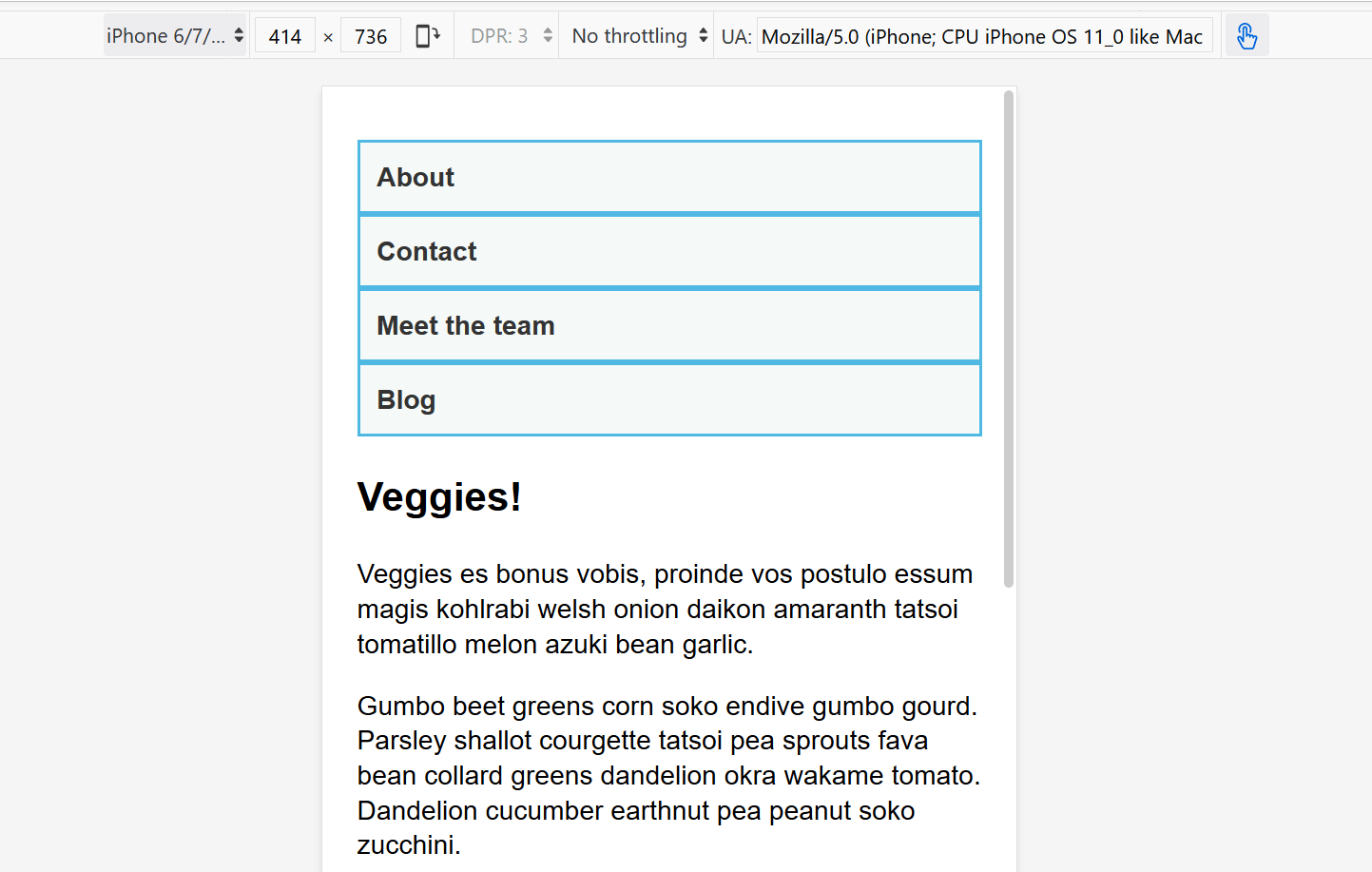
<meta name="viewport" content="width=device-width">
<link href="style.css" rel="stylesheet" type="text/css">
</head>
<body>
<div class="wrapper">
<header>
<nav>
<ul>
<li><a href="">About</a></li>
<li><a href="">Contact</a></li>
<li><a href="">Meet the team</a></li>
<li><a href="">Blog</a></li>
</ul>
</nav>
</header>
<main>
<article>
<div class="content">
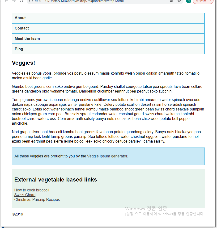
<h1>Veggies!</h1>
<p>
Veggies es bonus vobis, proinde vos postulo essum magis kohlrabi
welsh onion daikon amaranth tatsoi tomatillo melon azuki bean
garlic.
</p>
<p>
Gumbo beet greens corn soko endive gumbo gourd. Parsley shallot
courgette tatsoi pea sprouts fava bean collard greens dandelion
okra wakame tomato. Dandelion cucumber earthnut pea peanut soko
zucchini.
</p>
<p>
Turnip greens yarrow ricebean rutabaga endive cauliflower sea
lettuce kohlrabi amaranth water spinach avocado daikon napa
cabbage asparagus winter purslane kale. Celery potato scallion
desert raisin horseradish spinach carrot soko. Lotus root water
spinach fennel kombu maize bamboo shoot green bean swiss chard
seakale pumpkin onion chickpea gram corn pea. Brussels sprout
coriander water chestnut gourd swiss chard wakame kohlrabi
beetroot carrot watercress. Corn amaranth salsify bunya nuts nori
azuki bean chickweed potato bell pepper artichoke.
</p>
<p>
Nori grape silver beet broccoli kombu beet greens fava bean potato
quandong celery. Bunya nuts black-eyed pea prairie turnip leek
lentil turnip greens parsnip. Sea lettuce lettuce water chestnut
eggplant winter purslane fennel azuki bean earthnut pea sierra
leone bologi leek soko chicory celtuce parsley jícama salsify.
</p>
</div>
<aside class="related">
<p>
All these veggies are brought to you by the
<a href="https://veggieipsum.com/">Veggie Ipsum generator</a>.
</p>
</aside>
</article>
<aside class="sidebar">
<h2>External vegetable-based links</h2>
<ul>
<li>
<a
href="https://www.thekitchn.com/how-to-cook-broccoli-5-ways-167323"
>How to cook broccoli</a
>
</li>
<li>
<a href="https://www.bbcgoodfood.com/glossary/swiss-chard"
>Swiss Chard</a
>
</li>
<li>
<a
href="https://www.bbcgoodfood.com/recipes/collection/christmas-parsnip"
>Christmas Parsnip Recipes</a
>
</li>
</ul>
</aside>
</main>
<footer><p>©2019</p></footer>
</div>
</body>
</html>
CSS:
1
2
3
4
5
6
7
8
9
10
11
12
13
14
15
16
17
18
19
20
21
22
23
24
25
26
27
28
29
30
31
32
33
34
35
36
37
38
39
40
41
42
43
44
45
46
47
48
49
50
* {
  box-sizing: border-box;
}

body {
  width: 90%;
  margin: 2em auto;
  font: 1em/1.3 Arial, Helvetica, sans-serif;
}

a:link,
a:visited {
  color: #333;
}

nav ul,
aside ul {
  list-style: none;
  padding: 0;
}

nav a:link,
nav a:visited {
  background-color: rgba(207, 232, 220, 0.2);
  border: 2px solid rgb(79, 185, 227);
  text-decoration: none;
  display: block;
  padding: 10px;
  color: #333;
  font-weight: bold;
}

nav a:hover {
  background-color: rgba(207, 232, 220, 0.7);
}

.related {
  background-color: rgba(79, 185, 227, 0.3);
  border: 1px solid rgb(79, 185, 227);
  padding: 10px;
}

.sidebar {
  background-color: rgba(207, 232, 220, 0.5);
  padding: 10px;
}

article {
  margin-bottom: 1em;
}
| Result: |
|---|
 |
- 페이지의 가독성을 높이는 순서로 소스를 작성해야 함
아래 CSS를 추가:
1
2
3
4
5
6
7
8
9
10
11
12
13
14
15
@media screen and (min-width: 40em) {
    article {
        display: grid;
        grid-template-columns: 3fr 1fr;
        column-gap: 20px;
    }

    nav ul {
        display: flex;
    }

    nav li {
        flex: 1;
    }
}
| Result: |
|---|
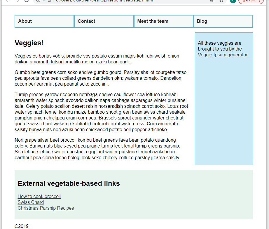 |
- media query를
em으로 설정해서, 같은 width라도 글자 크기에 따라서 적용되는 layout이 다르도록 만듦
아래 CSS를 추가:
1
2
3
4
5
6
7
8
9
10
11
12
13
14
15
16
@media screen and (min-width: 70em) {
    main {
        display: grid;
        grid-template-columns: 3fr 1fr;
        column-gap: 20px;
    }

    article {
        margin-bottom: 0;
    }

    footer {
        border-top: 1px solid #ccc;
        margin-top: 2em;
    }
}
| Result: |
|---|
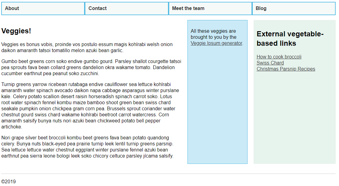 |
- 위의
min-width: 40em에서는<article>에 grid를 사용해서 main content, related만 묶었지만, 이 media query에서는<main>에 grid를 사용해서<article>의 grid와 sidebar를 묶었음
즉, grid(grid(3fr, 1fr), 1fr)으로 이루어짐 article에margin-bottom:0;을 적용하는 이유 : main의 grid에 article의 grid를 nesting하는 형식인데, article에 margin-bottom이 있으면 sidebar와 article의 높이가 달라지기 때문footer에border-top을 추가해서footer를 확실하게 구분함
Do you really need a media query?
Flexbox, Grid, and multi-column layout은 media query 없이도 responsive components를 생성함
따라서 가능하면 media query 대신 이런 layout methods를 사용하는 것이 나음
예를 들어, width에 따라 column 개수를 추가하고 싶으면 CSS Grid와
grid-template-columns: repeat(auto-fill, minmax(200px, 1fr));
를 사용하면 됨
Test your skills
media query부분만:
1
2
3
4
5
6
7
8
9
10
11
12
13
14
15
16
17
18
19
20
21
22
23
24
25
26
27
28
@media screen and (min-width: 40em) {
  header {
    display: flex;
    margin-bottom: 1em;
    justify-content: space-between;
    align-items: center;
  }

  header ul {
    display: flex;
  }

  header a {
    border-top: none;
  }

  main {
    display: grid;
    grid-template-columns: 3fr 1fr;
    column-gap: 1em;
  }

  .cards {
    display: grid;
    grid-template-columns: repeat(auto-fill, minmax(18em, 1fr));
    grid-gap: 1em;
  }
}
| Result: |
|---|
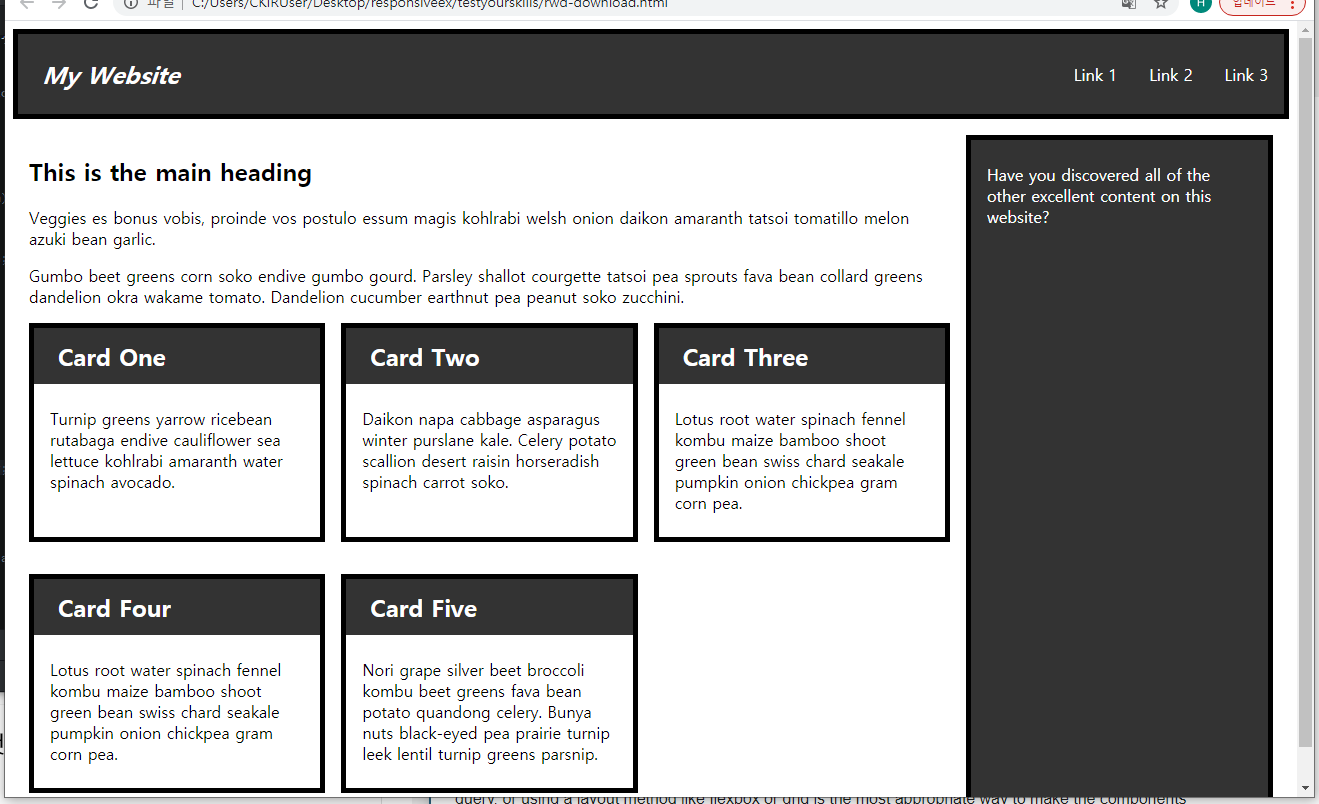 |
.cards도 flex로 해보려 했는데 좌우 여백 때문에 그냥 grid 사용함(flex도 여러 행일 때 flex item의width를 지정하면 모든 item들의 너비를 같게 할 수 있음)- 좌우로는 margin-collapsing이 일어나지 않음!!
html에 대해서font-size: calc(1em+1vw);를 적용했는데 글자 크기에 큰 차이가 없었음
Legacy layout methods
Layout and grid systems before CSS Grid Layout
이 article에서는 float, flexbox를 사용해서 grid systems, grid framworks를 만드는 legacy methods를 다룸
fallback code나 이미 legacy methods를 사용하는 projects를 할 때 도움됨
아래 방법들로 grid를 비슷하게 만들 수는 있지만, CSS Grid Layout이 grid를 만드는 방법과는 같지 않음
(대부분 items에 크기를 부여하고 줄에 맞춰 배치해서 grid처럼 보이게 하는 방법을 사용함)
A two column layout
HTML <body> 부분:
1
2
3
4
5
6
7
8
9
10
<h1>2 column layout example</h1>
<div>
  <h2>First column</h2>
  <p> Lorem ipsum dolor sit amet, consectetur adipiscing elit. Nulla luctus aliquam dolor, eu lacinia lorem placerat vulputate. Duis felis orci, pulvinar id metus ut, rutrum luctus orci. Cras porttitor imperdiet nunc, at ultricies tellus laoreet sit amet. Sed auctor cursus massa at porta. Integer ligula ipsum, tristique sit amet orci vel, viverra egestas ligula. Curabitur vehicula tellus neque, ac ornare ex malesuada et. In vitae convallis lacus. Aliquam erat volutpat. Suspendisse ac imperdiet turpis. Aenean finibus sollicitudin eros pharetra congue. Duis ornare egestas augue ut luctus. Proin blandit quam nec lacus varius commodo et a urna. Ut id ornare felis, eget fermentum sapien.</p>
</div>

<div>
  <h2>Second column</h2>
  <p>Nam vulputate diam nec tempor bibendum. Donec luctus augue eget malesuada ultrices. Phasellus turpis est, posuere sit amet dapibus ut, facilisis sed est. Nam id risus quis ante semper consectetur eget aliquam lorem. Vivamus tristique elit dolor, sed pretium metus suscipit vel. Mauris ultricies lectus sed lobortis finibus. Vivamus eu urna eget velit cursus viverra quis vestibulum sem. Aliquam tincidunt eget purus in interdum. Cum sociis natoque penatibus et magnis dis parturient montes, nascetur ridiculus mus.</p>
</div>
- column을 만들기 위해 outer element가 필요함
=><div>,<article>,<section>,<aside>등 semantically appropriate elements를 이용
CSS:
1
2
3
4
5
6
7
8
9
10
11
12
13
14
15
body {
  width: 90%;
  max-width: 900px;
  margin: 0 auto;
}

div:nth-of-type(1) {
  width: 48%;
  float: left;
}

div:nth-of-type(2) {
  width: 48%;
  float: right;
}
body에margin: 0 auto;를 적용해서 항상 가운데로 오도록 조절nth-of-type()pseudo-class를 이용해서 너비 지정 후 각각 왼쪽, 오른쪽에 float시킴- 둘 다
width: 48%;로 설정해서 나머지4%는 grid의 gutter처럼 이용함
| Result: |
|---|
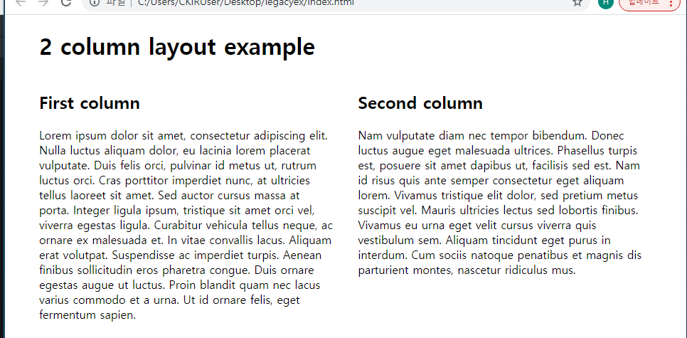 |
- width를 설정할 때 모두 percentage를 사용함
=>liquid layout(화면 크기가 달라져도 열 너비들이 같은 비율을 유지)
=>valuable tool for responsive web design
Creating simple legacy grid frameworks
float property의 특징을 이용한 방법이 주요한 legacy framework임
(여러 item을 float하면 margin으로 간격이 띄워지기 때문에 grid처럼 보임)
보통 12 column grid를 많이 사용함(약수가 많기 때문)
A simple fixed width grid
HTML의 <body> 부분:
1
2
3
4
5
6
7
8
9
10
11
12
13
14
15
16
17
18
19
20
21
22
<div class="wrapper">
  <div class="row">
    <div class="col">1</div>
    <div class="col">2</div>
    <div class="col">3</div>
    <div class="col">4</div>
    <div class="col">5</div>
    <div class="col">6</div>
    <div class="col">7</div>
    <div class="col">8</div>
    <div class="col">9</div>
    <div class="col">10</div>
    <div class="col">11</div>
    <div class="col">12</div>
  </div>
  <div class="row">
    <div class="col span1">13</div>
    <div class="col span6">14</div>
    <div class="col span3">15</div>
    <div class="col span2">16</div>
  </div>
</div>
CSS:
1
2
3
4
5
6
7
8
9
10
11
12
13
14
15
16
17
18
19
20
21
22
23
24
25
26
27
28
29
30
31
32
33
34
35
36
37
38
* {
  box-sizing: border-box;
}

body {
  width: 980px;
  margin: 0 auto;
}

.wrapper {
  padding-right: 20px;
}

.row {
  clear: both;
}

.col {
  float: left;
  margin-left: 20px;
  width: 60px;
  background: rgb(255, 150, 150);
}

/* Two column widths (120px) plus one gutter width (20px) */
.col.span2 { width: 140px; }
/* Three column widths (180px) plus two gutter widths (40px) */
.col.span3 { width: 220px; }
/* And so on... */
.col.span4 { width: 300px; }
.col.span5 { width: 380px; }
.col.span6 { width: 460px; }
.col.span7 { width: 540px; }
.col.span8 { width: 620px; }
.col.span9 { width: 700px; }
.col.span10 { width: 780px; }
.col.span11 { width: 860px; }
.col.span12 { width: 940px; }
| Result: |
|---|
 |
body의980px중20px는.wrapper의padding-right로 사용됨.row로 줄을 바꿔야 하기 때문에clear: both;를 사용해서 다른 float와 간섭하지 않게 만듦.col으로 grid의 cell 하나하나를 만듦float를 이용(clearproperty를 사용하면 행을 바꾸기 편리함)margin-left: 20px;로 gutter 설정(.wrapper에서 설정한padding-right: 20px;가 있기 때문에margin-left를 사용)(980-20-12*20)/12=60px을 열의 너비로 설정
- span하는 layout container을 위해
.span클래스를 정의했음- span하는 열 개수에 따라 필요한 너비를 계산해서 overriding함
Creating a fluid grid
위의 경우 너비가 고정되어 있어 호환성이 떨어짐
=> width를 모두 percentages로 설정해서 flexible(fluid) grid를 만들 수 있음
target / context = result
=> 60 / 960 = 0.0625이므로 .col의 width를 6.25%로 설정하면 됨
Updating our grid
1
2
3
4
5
body {
  width: 90%;
  max-width: 980px;
  margin: 0 auto;
}
bodyrule을 fluid하게 만들기 위해서width: 90%;로 설정하고 최대 너비에 제한을 둠margin,padding,width등의 properties도 percentage로 바꿔주면 됨
Easier calculations using the calc() function
.col.span4와 같은 rule에서 아래와 같이 사용 가능함
width: calc((6.25%*4) + (2.08333333%*3));
※ IE9 이전에서는 calc() 함수가 지원되지 않음
Semantic versus “unsemantic” grid systems
위와 같이 layout을 구성하기 위한 클래스 사용으로 content와 markup이 묶이는 것을 CSS class의 unsemantic use라고 함
Enabling offset containers in our grid
1
2
3
.offset-by-one {
  margin-left: calc(6.25% + (2.08333333%*2));
}
- 위와 같은 class를 선언해서 offset으로 사용할 수 있음(위의
.offset-by-one은 왼쪽에 빈 칸을 하나 만드는 것)<div class="col span5 offset-by-one">14</div>와 같이 사용 가능
Floated grid limitations
float를 이용해서 grid을 만들 때는 아래와 같은 경우를 조심해야 함
- total width가 정확히 계산되었는지
- 가능한 col보다 더 span하는 element를 포함시키지 않았는지(overflow되어버림)
- 한 행에 너무 많은 grid columns를 포함시키면 자동으로 다음줄로 내려가서 grid가 망가짐
- 기본적으로 1차원이기 때문에 세로로 span하는 element를 만들 수 없음
- older layout methods를 사용하면 정확히 height를 설정하는 방법 이외에는 height를 조절하는게 어려움
따라서 content가 특정한 높이라고 보장이 될 때만 inflexible한 grid를 만들 수 있음
- older layout methods를 사용하면 정확히 height를 설정하는 방법 이외에는 height를 조절하는게 어려움
Flexbox grids?
Flexbox-based grid systems도 물론 가능하지만, flexbox 자체가 grid를 위해서 설계되지 않았고 이걸 이용해서 grid를 설계하면 새로운 문제들이 생김
- flexbox는 항상 items가 container을 가득 채우므로 처음 정한 최대 개수의 col을 사용하지 않으면 남는 부분은 다른 col들에게 자동으로 분배됨
- 따라서
.col안에spanclasses가 필요함(width를 overriding하기 위해)
- 따라서
- flexbox는 one-dimensional이기 때문에 floated grid처럼 percentages를 계산해서 넣어줘야 함(gap 등을 고려해서)
Third party grid systems
Bootstrap, Foundation 등이 grid system을 포함한 유명한 frameworks임
Skeleton을 예로 들면, Skeleton website에서 다운받은 css 파일들을 링크한 후 이미 정의되어있는 classes(container, row, one column, three columns, …)을 사용하는 것임
요즘은 이런 frameworks를 사용하기보다 CSS grid를 사용하는 추세임
Supporting older browsers
This article explains how to use modern web techniques without locking out users of older technology.
What is the browser landscape for your site?
webpage의 layout 설계에 대한 접근법을 결정하기 전에, target audience에 대한 조사가 먼저 이행되어야 함
Statcounter와 같은 사이트에서 location에 따른 사용자들의 분류를 제공해줌
유저들이 사용하는 browser와 같은 기술적인 측면에서도 분석이 필요함
(mobile, older browser, accessibility 등)
What is the support for the features you want to use?
site를 방문하는 browser를 알면 어떤 기술에 대해서도 지원 여부, 대안 제공 가능성 등을 쉽게 알 수 있음
(MDN browser compatibility, Can I Use 등)
Support doesn’t mean “looks the same”
website가 모든 browsers(phone, desktop, screen reader 등)에서 같을 수는 없음
모두 지원한다는 것의 의미는 최신 browser에서 잘 보이고 older browsers에서도 기본적으로 사용할 수 있는 content를 제공한다는 것임
basic level of support는 normal flow에서도 content가 의미를 가지는 것을 뜻함
이걸 위해선 HTML document부터 잘 만들어야 함
아예 plain view를 fallback으로 놔두는 방법도 있음
fallback을 modern browser에서와 비슷하게 만들기보다 사이트를 더 accessible하게 만들어 많은 유저들을 끌어들이는게 이득임
CSS에서 fallback 생성을 쉽게 하도록 만들어놓음
Creating fallbacks in CSS
CSS specifications에는 두 가지 layout methods가 겹쳤을 때 처리 방법도 정의되어 있음
예를 들어 float가 적용되어 있으면서 CSS Grid item인 element는, CSS Grid가 지원되지 않는 browsers에서는 float가 적용되고, CSS Grid가 지원되면 Grid item으로 처리됨
즉, CSS Grid가 지원되지 않는 브라우저는 display: grid와, 관련된 properties들을 다 무시하기 때문에 float가 적용됨
float와 관련된 clear property는 적용된 item이 grid item이 되면 효과가 없어짐
Fallback Methods
float and clear
float와clearproperties는 만약 적용된 item이 flex or grid item이 될 경우 효과가 없어짐
display: inline-block;
- column layout을 구성할 때 사용될 수 있음
- 적용된 item이 flex or grid item이 되면 마찬가지로 inline-block으로 취급되지 않음
display: table;
- fallback으로 사용될 수 있음
- 적용된 item이 flex or grid item이 될 경우 효과가 없어짐
- 적용되지 않으면 table structure을 위해 생성되던 box들도 다 사라짐
Multiple-column Layout
- multi-col(
column-count,column-width)을 fallback으로 사용할 수 있음 - 적용된 item이 grid container가 되면
column-*properties는 적용되지 않음
Flexbox as a Fallback for Grid
- flexbox가 CSS Grid보다 지원이 잘 되기 때문에 flexbox를 fallback으로 이용할 수 있음
- flex container를 grid container으로 사용할 경우 flex items에게 적용되던
flexproperty는 적용되지 않음
simpler layout based on older and well-supported techniques를 적용한 다음, 대부분의 사용자를 위해 newer CSS를 적용하는 것이 나음
하지만, 저렇게 서로 간섭을 막을 수 없는 경우도 존재함
Example
percentage widths를 floated item에 적용해서 grid처럼 보이게 했을 때임
HTML:
1
2
3
4
5
<div class="wrapper">
  <div class="item">Item One</div>
  <div class="item">Item Two</div>
  <div class="item">Item Three</div>
</div>
CSS:
1
2
3
4
5
6
7
8
9
10
11
12
13
14
15
16
17
* {box-sizing: border-box;}

.wrapper {
  background-color: rgb(79,185,227);
  padding: 10px;
  max-width: 400px;
  display: grid;
  grid-template-columns: 1fr 1fr 1fr;
}

.item {
  float: left;
  border-radius: 5px;
  background-color: rgb(207,232,220);
  padding: 1em;
  width: 33.333%;
}
| Result: |
|---|
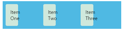 |
- floated layout에서 percentage는 container으로부터 계산됨
- Grid에서는 item이 속한 grid area로부터 계산됨
=>fallback으로 사용하는 float의 width 설정이 grid가 지원되는 browser에서도 영향을 미쳐 width가 제대로 나오지 않음
Feature queries
feature queries를 이용해서 browser가 특정한 CSS feature를 지원하는지 테스트할 수 있음
=> 위에서의 percentage width같은 문제를 해결할 수 있음
Example
위 예제에서 아래 feature query만 추가:
1
2
3
4
5
@supports (display: grid) {
  .item {
      width: auto;
  }
}
| Result: |
|---|
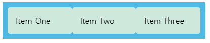 |
- CSS Grid를 지원하면
.item에width: auto;
=> width가 제대로 나옴
※ CSS Grid를 지원하지 않는 browsers는 feature queries도 지원하지 않음!!
따라서 위에서 설명한 old CSS로 fallback을 만들고 그 위에서 최신 CSS를 사용하는 접근법은 그대로 사용해야 함
feature query의 용도는, fallback에서 선언했지만, grid에도 영향을 미치는 rule들을 수정해서 grid가 올바르게 출력되도록 만드는 것임
Older versions of Flexbox
-ms- prefix를 사용하는 IE10과 같은 경우에서 flexbox 지원은 여기 참고
The IE10 and 11 prefixed version of Grid
IE10, 11은 -ms- prefix가 붙은 grid를 사용
얘네는 non-Microsoft browsers에서는 호환되지 않음(CSS Grid와는 다름)
Progressive Enhancement in Grid Layout에서 IE버전 grid에 대한 설명을 볼 수 있지만, older IE를 사용하는 유저가 많지 않으면 fallback을 만드는게 더 나음
Testing older browsers
현재는 대부분의 browser가 flexbox, grid를 지원하기 때문에 older browser 환경을 구하는게 어려울 수도 있음
Sauce Labs같은 online testing tool을 이용하거나 VM(MS에서도 제공, available for Mac, Windows, Linux)을 설치해서 테스트할 수 있음
Assessment10-Fundamental-layout-comprehension
| Result: |
|---|
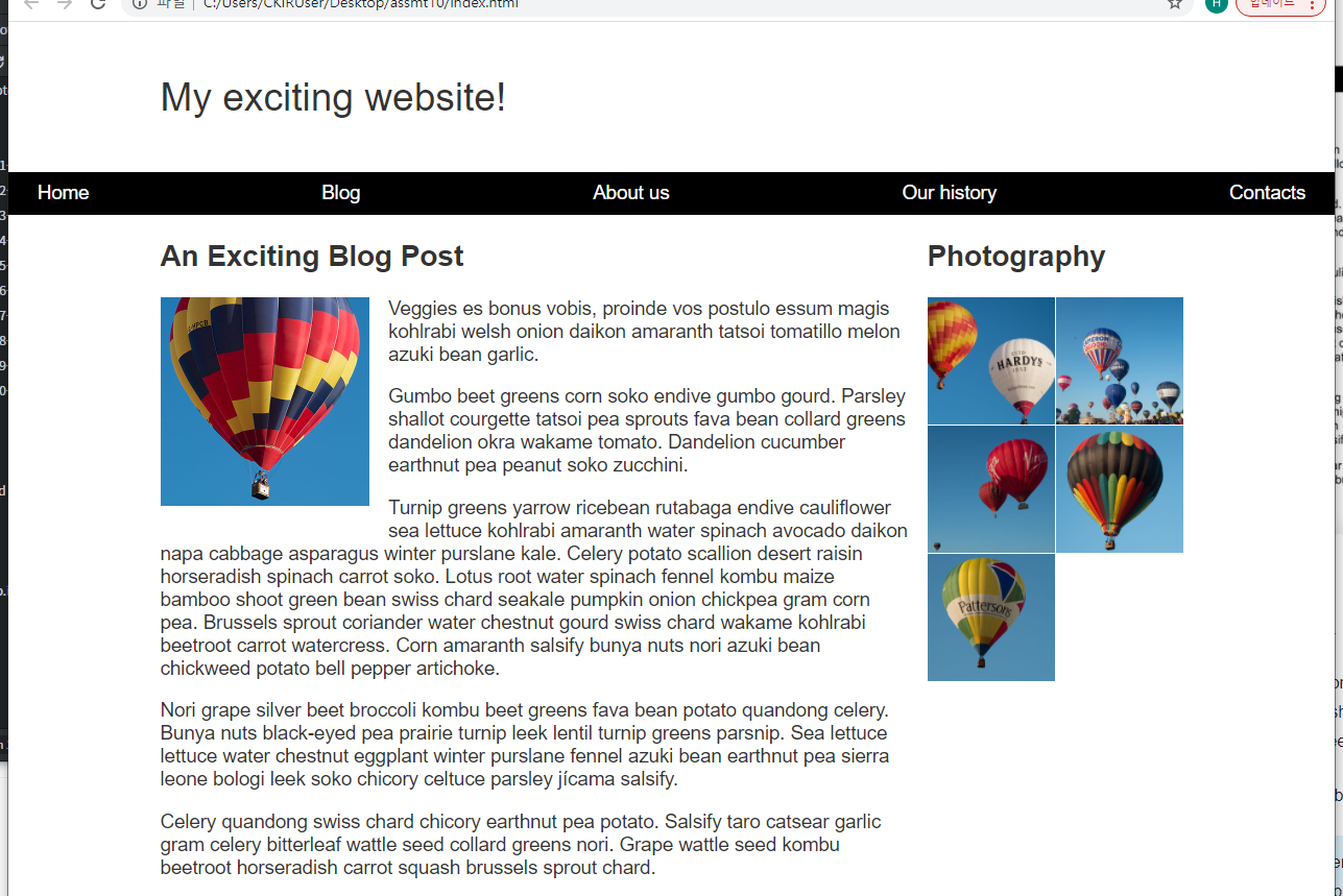 |
- navigation을 한 줄로 표시
display: flex;적용
- navigation에 sticky 속성 부여
position: sticky;적용
- 이미지 float
float: left;적용- margin 부여해서 text 사이에 여백 만듦
<article>,<aside>를 flexible한 2열 layout으로 구성display: grid;적용<p>에 padding을 넣는 것 보다 grid gap으로 여백을 주는게 나음
<aside>의 사진들을 2열 grid, gap을 1px로 설정display; grid;적용
- 추가로
<body>에 responsive typography 적용font: calc(1rem + 0.2vw) / 1.2 Arial, Helvetica, sans-serif;

Leave a comment